Tuesday 28 May 2013

Assignment 5: the unnacceptable images

I am once again thinking about Assignment 5, which is my study of houses in Brisbane, Queensland, specifically in the Windsor area. I am interested in the typology of these houses, and have taken a few hundred photos of houses in the area on days of various weather, sun angle etc. I am now looking at choosing the final set to work on in Photoshop, and as part of this, am considering my rejects first. I had previously gone through and 'starred' my images, and considered which ones were good enough to consider for the assignment.

Since I am looking at typology, the set needs to be consistent, almost above every other aspect!! That said, the photos need to be interesting, there needs to be visual appeal, and the images need to be well presented and prepared appropriately. I am no longer able to take any more photos, as I don't live in the area any more and cannot travel there, but I feel like this is not at all a problem as I have a large set of images to work with, and previously considered capturing the images in a consistent manner.

I started with 46 images in my 'Houses' collection. A couple of these were 'doubles', that is, houses that I photographed on more than one occasion, for one reason or another. For example, if the weather was a bit overcast on one day, but I wanted to record the house anyway as I was there, I took the shot in the poorer weather and then returned on another day. I also sometimes was unlucky with cars being parked in front of the house, but took the shot anyway, then I could decide later if it was worth returning to or not. I also photographed one lovely sunny day that also happened to be bin collection day... not ideal. Below is an example of one of my doubles that I returned to later:

a house I returned to (left photo) to capture an image without bins, and also with better sky
The second image (left) has the advantage of the bins not being present, and also the weather is better for my selection, which has almost all blue skies.

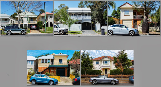
Another reason for images not being acceptable was the presence of parked cars. For some houses there was simply always a parked car out the front, so I could never get an image without a car there.

houses with cars parked out the front
As I discussed in this blog post (Alteration), I could spend numerous hours removing cars from the image (not really my strong point!), but this is not the aim of my exercise nor my interest, so I am not going down that route!

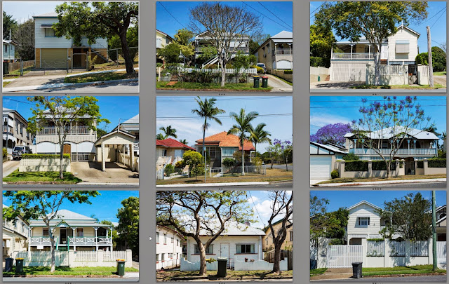
Another group of houses had large trees that just seemed to take over the image too much. Looking at these as a grid they could almost be a set of their own! However they were not suitable for this project, despite me quite liking a couple of them, they didn't fit in with the others I selected. Some of these also had the 'bin' problem! I took a couple of these thinking that it might be interesting to have the house 'hiding' behind the tree, but visually it didn't really work all that well, though I do like a couple (middle top row and middle and right second row in particular).

houses with large trees present
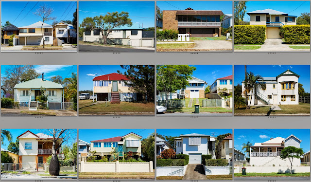
Finally there were the images that just didn't have the right 'feel', or lacked a certain oomph. There is nothing wrong with these images, the houses just weren't quite right for my taste, or once again didn't fit in with the set as a whole. A couple suffer from the 'bin' issue also. It is quite hard for me to define what it is I don't like about these images, they just are not as coherent as the final set.

rejects just because they didn't fit in
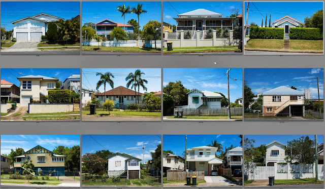
So then I have the final set of 12 which I think I will now go forward with editing and preparing for presentation. They are shown below:

Final 12 images
They are not ordered as I plan to present them, but they still feel like quite a coherent set. There are a couple with bins which I will decide later on whether I keep or remove digitally. I also need to do some straightening of verticals and horizontals, and need to get the skies a more consistent colour perhaps? There will be individual tweaks to each image and I have done some cropping on the above images which I will review when doing the next stage of processing in Photoshop. I plan to open them in the raw convertor, apply constant adjustments for each image, then open them as smart objects in Photoshop, do further cropping/cloning/straightening as required, and still have the flexibility to go back to the raw editing later if it is necessary. I think this is the best way for me to edit them as a set, especially as I won't be able to do all the editing at once. I will also try to keep some notes and document some of the editing on this blog for my own learning.


Monday 27 May 2013

Exercise: Sharpening for print

The aim of this exercise is to see the effect of sharpening on an image. This is a good exercise for me as I have not really toggled much with the sharpening, and certainly don't know about the differences between sharpening for screen or print, except that there is a difference!

I have chosen a reference image, as suggested I have chosen a portrait image, shown below with no sharpening applied (at this point I note that Lightroom by default does apply sharpening). I have zoomed in (using Photoshop Raw) over an area of the original image, where at 100% it about fits the size of my print at 8 by 10. I was unsure of how to otherwise 'print at full size', as this is a bit vague, depending on camera resolution and DPI etc.

What is sharpening?
I decided to do some reading about what sharpening is, and why it is used. It is used differently depending on if a print is for screen or print, and probably also depending on what paper it is printed on (eg newspaper vs gloss vs canvas or other materials). I found the following information on a fellow students blog which I have copied below to help me out:

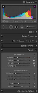
Screen-shot_Details Amount Slider: This slider allows regulating amount of sharpening; setting the value to 0 can turn off the sharpening. Depending on the amount specified, the contrast between varying pixels increases. This creates the illusion of the edges being sharpened.
Radius: Regulates the area to which sharpening is applied (outside the perceived edge). It is like the feather effect of “Photoshop”. Need to use this slider judiciously; otherwise it can produce strange effect.
Detail: This slider adjusts how much sharpening will be applied on the details of the image. Smaller number will be restricted towards the edge, where as a higher number will affect greater details. This slider can help to bring out the texture. However, there is a risk of increasing the noise in an image.
Masking : This is the most practical and nifty feature. It masks the area that does not require sharpening. It is similar to the mask tool in Photoshop however; it is not as controlled.
 Taken from http://ocastudynotes.wordpress.com/2012/05/16/775/ for personal study purposes

I should note that it is important not to over-sharpen as this can introduce noise into images (an interesting article in Wikipedia). And to always observe the changes when zoomed in, at or around 100% magnification, to see the effects properly.

The sharpening was actually undertaken in Photoshop, but the same RAW engine is underneath both programs, so I won't investigate any differences in the two software packages (there shouldn't' be any!). I have not done any other editing.

no sharpening applied
The next image has 'mild' sharpening applied (settings below also).
mild settings of sharpening
settings for mild
The next image has 'medium' sharpening applied
medium settings of sharpening
settings for medium
The final image has 'heavy' sharpening applied
heavy settings of sharpening
settings for heavy
The differences are really only noticeable when zoomed in on screen, but they really are there! I mostly concentrated on the eye area, as this is where the camera was focused and should be nice and sharp.

I then uploaded the four images to a new site, Atkins Technicolor, which is based in Adelaide (where I now live) for printing. I have had some prints done there before, they are somewhat expensive, but a professional printing lab and I know that they will be high quality. I would like to use them for all my final printing for my work from now on, despite the costs. The advantage is I don't have to pay for postage and can just visit them in a lunch-break from my office, thus being moderately convenient. I note that we are meant to have a printer for this course. We don't own one and never have, and I must admit I don't really want to start fiddling with inks and having a huge printer in my work area, so I am going to avoid it for now and if it becomes an issue in the future I will deal with it then. I can't imagine every single OCA student has a printer at home...

Once I had the prints at home, I observe the differences...

Firstly I compared each print with the other. The 'none' version does look quite soft, particularly when compared with the others. The 'mild' and 'medium' both look good - the eyelashes are sharp and there is some texture on the cheeks and nose but not too much generally. The 'heavy' is noticeably sharper all over, probably to the detriment of the image, with there being too much sharpness on the cheeks and nose which should be softer. This could probably be controlled with the 'masking' option in Lightroom and Photoshop, which simply masks out continuous areas so they are not sharpened. 

When comparing between the print and the screen, I think the print can handle more sharpening than the screen image. This is probably because there is some slight matte-ness to the paper that 'absorbs' some of the sharpening? The 'heavy' for example, in print, just looks a little too sharp, whereas on the screen it is quite obviously over-sharp. I would probably choose the 'medium' for my selection in print form, whereas I would choose the 'mild' for the onscreen version.

Conclusions:

I think that the amount of sharpening required will vary for different scenes - perhaps a landscape print will need different sharpening to a portrait and so on. Something that should be tested before any large scale prints are made perhaps? The prints are more 'forgiving' than the screen for sharpening, so perhaps I should apply slightly more sharpening for printing than for on-screen images. Generally though I don't use much sharpening, just stick to the default for Lightroom ('mild' in my testing above) which seems to do a good job generally. It's always possible to sharpen more later, but removing sharpening is less easy!!

References:

http://www.atkins.com.au/tkins-prints-online/ [Accessed on 24/05/13]

Wikipedia (2013), Unsharp masking [online], Available from http://en.wikipedia.org/wiki/Unsharp_masking [Accessed on 27/05/13]

Madhvee Deb (2012), OCA Learning Log [online], Available from http://ocastudynotes.wordpress.com/2012/05/16/775/ [Accessed on 27/05/13]

Wednesday 22 May 2013

Assignment 5: More research

I am in the process of preparing for Assignment 5. I took the photos late last year and am just commencing processing and bringing them together as a set. I was browsing blogs tonight and came across Keith Greenough's set of beach huts from Miami. Wow, they look great all together! My set of Queenslanders won't be nearly as distincive, but I like that I'm thinking along the same lines of someone so much further on in the Photographic study as me! Perhaps I will get there...

He has chosen a consistent viewpoint and angle, filling the lower middle of the frame with the hut, and allowing more sky in at the top. How does he do this using a large-format camera? It must be incredibly difficult to remember exactly where he placed the other huts within the frame and fill them to almost exactly the same space. I found this hard with my houses when I was photographing them. He also has quite consistent weather - he has shot at the same time of day and the weather looks fairly constant between each shot. I also took the time to shoot with the sun roughly directed constantly on the houses, and even chose houses on one side of the street and not the other for that reason. I also almost always shot on sunny, blue sky days (we get a lot of those in Queensland!)

I  like the way he presents them as a grid (like I want to do with mine) and the lovely soft colours are great. Not bad given he only spent 45mins a day doing photography on his holiday... (more than I managed on my recent holiday, but I don't think he had a 3year old and 8mth old with him!). Below is my version of a beach hut, taken at 90 Mile Beach, Lakes Entrance (Victoria) which I took in February as we were driving from Brisbane to Adelaide.

Beach hut, Lakes Entrance, 90 Mile beach

References:
Greenough, K photo-graph. Online, available at: http://photo-graph.org/2013/04/26/8-lifeguard-stations-south-beach-miami-usa/ [accessed 22/05/13]


Alma Haser Photographer

I was reading the L E N S C R A T C H blog this week and came across an interesting artist, Alma Haser. She was highlighted on the blog for winning a prize called 'Cosmic Surgery'. I am not personally interested in editing photos in this manner (not yet anyway), but I am fascinated by what some artists do with their images. I understand that these are photos of friends, which are them printed, cut up and folded into Origami, and then placed back on the image and re-photographed. This method seems complicated and time-consuming, but the results are quite interesting. They are both three-dimensional and two, flat and raised at the same time. The faces of the subjects are mostly or partly obscured by the folded print, and as a result eyes, noses and lips are repeated in strange orientations over the face. It is obviously still a face with character, but we would probably not recognise the person on the street. Is it a portrait therefore?

I have grabbed two images from the blog to display below for my own reference. They are slightly washed out and pale, and have a slightly old-worldly look - perhaps this is a result of the paper they are printed on, perhaps it is not photographic paper that she then cuts out and folds? Otherwise the portraits are lovely, but are definitely given an unusual feeling by the process of cut and fold and place.

I have heard of other photographers re-photographing their images afterwards - I wonder how they feel when they are doing this - is it an alternative form of post-processing? Perhaps using bright flash to obscure faces that shouldn't' be seen (I saw this in the BJP), and also sometimes photographers photograph their computer screens, to capture something there in a different way. All interesting modern techniques. The folding and montaging is all old technique though, being around in the dada and surrealist photography periods. Perhaps everything old is new again :)

taken from http://www.lenscratch.com/2013/05/alma-haser-magenta-foundation-bright.html for personal study purposes

taken from http://www.lenscratch.com/2013/05/alma-haser-magenta-foundation-bright.html for personal study purposes

References:

Smithson, A Lenscratch. Online, available at: http://www.lenscratch.com/2013/05/alma-haser-magenta-foundation-bright.html [accessed 22/05/13]

Assignment 4: Real or fake?


The aim of this assignment is to produce a cover for a imaginary book or magazine. I have chosen the cover of an Organic Gardening magazine, some examples of which are shown below (all sourced from Google images).


I have discussed in a previous post (here), some of the desirable aspects of creating a cover image, and I will mention a few more in this post also. I think simplicity is key. The image should hold one simple message, be it a beautiful chicken, a great example of a plant, or tasty healthy looking produce. The image needs to be simple with few elements. The focus should be on this one key part point and the rest of the image should just be supporting, i.e. a coloured, or out of focus background or complimentary in some simple way. Then the text around the image should fit in - similar or contrasting colouring, but consistent across the whole page. I am not a designer, so I have decided to just be very simple with my layout and design, but tried to think like a designer might.

I started out with two possible ideas, the first was a shot of a beautiful flower that I had been eyeing off in my garden. It only flowers once a year, for about a week, and is only at it's best for a day or two of that time. The light was soft (early evening), and the only viewpoint possible was from our balcony, so I took few a shots with my camera and 24-70mm lens.
Example of photos taken of the flower
The chosen image and resulting crop applied initially in Lightroom is displayed below. At this point I should say that I don't particularly think the image is very strong graphically, and definitely needs heavy cropping, which is not ideal (though my camera can cope). I decided to continue working with the image at this point because I thought it had some potential.

130114_054A316.CR2

24-70mm f/2.8 lens, Canon 5Dm3, f/6.7, 70mm, 1/60sec, ISO 125


Chosen image with initial crop displayed in Lightroom

I then took the image into Photoshop for further work. I processed the image using camera Raw. Highlights, clarity and vibrance were tweaked.
Processing in camera Raw
The image was brought into Photoshop as a smart object so that I could go back to the RAW processing if I needed to at a later point in the process. I decided that the background needed to be tidied so that any small light patches didn't show through, the spider web on the leaves needed to be removed, and some dusty looking patches removed also.


The starting image in Photoshop
Zoom in on spiderweb that needs removal.
The clone tool and heal tool were the most useful for removal of the spiderweb.
A light spot in the background is removed using the clone stamp
I removed many distracting light spots in the background and foreground, but tried not to be over-sensitive, that is, take out the natural beauty and character of the leaves. I feel like the changes I made were fairly minor, and acceptable as part of 'tidying' up the image. If I had access to a large ladder, I could have gone and actually cleaned the leaves of spiderwebs etc myself, though I could not have removed the bright spots, this could have been done in a darkroom by a talented practitioner, so I feel like these changes are ethically acceptable.

The resulting image is shown below on the left, compared with the image on the right which is the same but without the clone layer visible.
Compare with clone layer (left) and without (right)
The image on the left is somewhat 'cleaner', though at this scale the differences are hard to see. I have removed some distracting objects around the edge of the frame, and also the brown leaves in the lower centre of the frame have been removed to make it a bit cleaner.

No other selective editing was done. I thought the flowers had quite a bit of 'pop' already, and didn't need any more editing to enhance them. The background leaves were nicely darker, and the foreground leaves are bright and full of lively colour.

Finally, I chose a colour palette, and decided on a title and some appropriate words for my magazine cover. I decided to pick up on the strong green and contrast it with Red lettering (also picking up on the fact the magazine was the December (Christmas) issue. The final magazine cover is presented below.
Final magazine cover

In addition, I decided to try shooting a still life with a heritage tomato, as an alternative. The cover is shown below, but I don't feel it is as effective as the flower above, which is fairly unique and special, in that it only flowers once a year. The still life is a bit more of a cliche. In this example, I needed to tidy up the tomato, extend the chopping board into the foreground, make the grey background a bit more continuous and extend it up also. I also used the colour picker tool to choose my font colours for this example. I used natural window light with some baking paper on the benchtops (for a neutral background) when taking the images (some examples are shown below).
Possible images for the tomato cover


Alternative magazine cover
Conclusions:
This assignment was challenging for me because I was very unsure what to shoot and how to choose a subject. Once I decided what genre to follow (by researching different magazine styles), this helped me to hone in on an appropriate subject. I tried a few different options and practiced some Photoshop editing techniques in the process. However, this is not a particular passion for me, so I decided not to agonize any more and simply present the magazine cover as it stands. I am unsure if the flower image is strong enough to present for an assignment, but as it looks on the cover I feel it is quite appropriate. I decided to try the tomatoes so I could have a second option, but I feel like the idea is a bit cliched. Overall, I think both covers are effective and would 'sell' magazines, that being the aim of the assignment, I feel like I have been moderately successful.

Ethically I feel like I have not pushed the boundaries with either image presented above. Cleaning up leaves and removing hot-spots is not particularly controversial and has not actually changed the final image very much at all. Nothing major was removed or added. So I am very much down the 'real' end of 'real or fake' for this assignment, mostly because that is where my interest lies.

Monday 20 May 2013

Thomas Demand


I also went to see the Thomas Demand exhibition on at the NGV. Although I really enjoyed it, I was not as interested as the Jeff Wall exhibition. The technique is quite fascinating - Demand builds (out of cardboard/paper/wire etc?) scenes that he has either imagined or seen elsewhere (I think he sources images from the internet for inspiration). Then he photographs the scenes. I think he doesn't keep any of the 'sets', which is quite amazing, as they would be amazing pieces of sculpture in their own right!! My notes are below.
Peg board 1996
Perfect from a distance, yet imperfections obvious close up.
Presented frameless, covered in Perspex, as if it really is a peg board
Slight discontinuities in the pattern
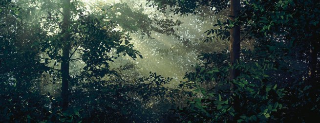
Clearing 2003
Thomas Demand German 1964- 'Lichtung / Clearing' 2003
taken from http://artblart.com/2013/03/11/exhibition-thomas-demand-at-the-national-gallery-of-victoria-melbourne/ for personal study purposes

Backlit leaves in a forest
Glow
Radiance
Yet dark too
Shafts of light
Shades of green
When you look carefully, realize its not real
Hyper-realistic
Can see places where leaves are tied on
Trunk doesn't look quite right either
Painstaking work
The vision to imaging the final result!
Very 3 dimensional
Lighting v important, long tradition of German artists in the forest scenes
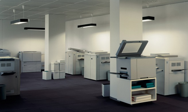
Copy shop 1999
Thomas Demand German 1964- 'Copyshop' 1999
taken from http://artblart.com/2013/03/11/exhibition-thomas-demand-at-the-national-gallery-of-victoria-melbourne/ for personal study purposes

Cold and very absent of people.
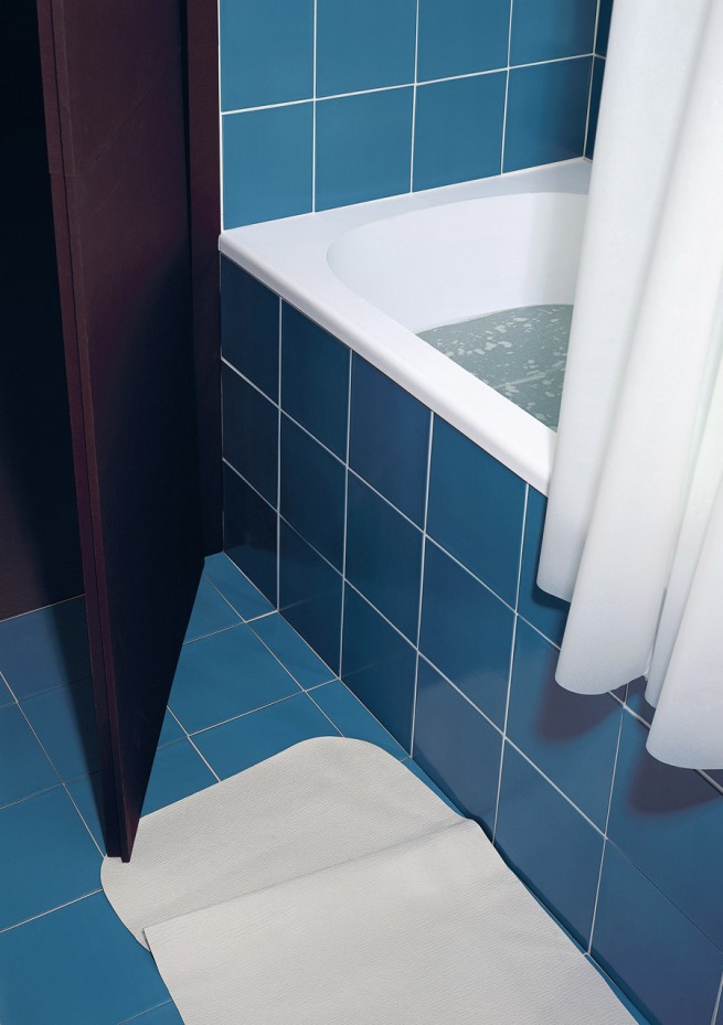
Bathroom 1997
Thomas Demand German 1964- 'Badezimmer / Bathroom' 1997
taken from http://artblart.com/2013/03/11/exhibition-thomas-demand-at-the-national-gallery-of-victoria-melbourne/ for personal study purposes

What is behind the curtain?
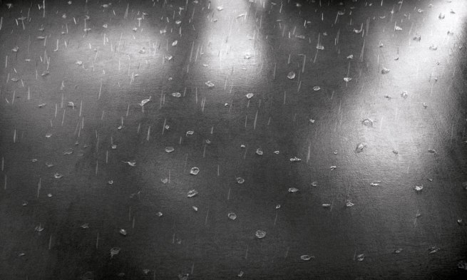
Rain 2008 (film)
Thomas Demand German 1964- 'Regen / Rain' (still) 2008
taken from http://artblart.com/2013/03/11/exhibition-thomas-demand-at-the-national-gallery-of-victoria-melbourne/ for personal study purposes

Very realistic! Yet something not quite right.
Great! I like it!
Bit like jumping beans that never stay still!
Stop animation?
Pacific Sun 2012 (film)
Looks like it was done on computer? Very clever! And effective
Quite disturbing sitting still and watching the madly rocking destruction before my eyes.
Based on CCTV footage
Interesting Demand is following the photographer turned videographer trend…
Camera (film) 2007
Being watched…
Lawn 1998
Lighting looks a bit unusual…
A bland but every changing view of grass
A representation
shed 2006
No dirt/mess!
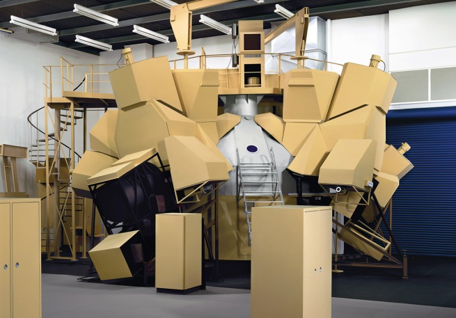
Space simulator 2003
Thomas Demand German 1964- 'Space Simulator' 2003
taken from http://artblart.com/2013/03/11/exhibition-thomas-demand-at-the-national-gallery-of-victoria-melbourne/ for personal study purposes

child like imagination of what a space ship might be like
The perfection is startling
Out of our known experience
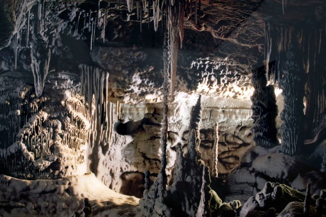
Grotto 2006
Thomas Demand German 1964- 'Grotte / Grotto' (detail) 2006
taken from http://artblart.com/2013/03/11/exhibition-thomas-demand-at-the-national-gallery-of-victoria-melbourne/ for personal study purposes

Looks almost pixelated
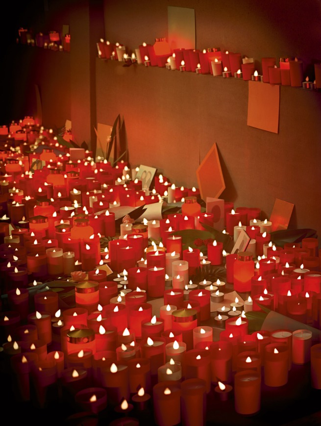
Tribute 2011
Thomas Demand German 1964- 'Tribute' 2011
taken from http://artblart.com/2013/03/11/exhibition-thomas-demand-at-the-national-gallery-of-victoria-melbourne/ for personal study purposes

Impersonal
Gives permanence to a scene that won't be repeated
Vault 2012
A hidden world, much like grotto, never to be visited by most of us
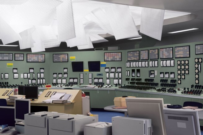
Control room 2011
Thomas Demand German 1964- 'Kontrollraum / Control Room' 2011
taken from http://artblart.com/2013/03/11/exhibition-thomas-demand-at-the-national-gallery-of-victoria-melbourne/ for personal study purposes

Bland and featureless
Devoid of people
Obviously not real
Very new topographer
Pattern and repetition in the buttons, knobs and switches
Fukushima, taken on a mobile phone
Eerie sense of calm… After the storm
White panels fallen from ceiling during tsunami
People removed from the scene, dials and switches etc, text removed from warning signs etc
Life size environments, he can walk through them when built
Proportion, scale and form. Sculptor.
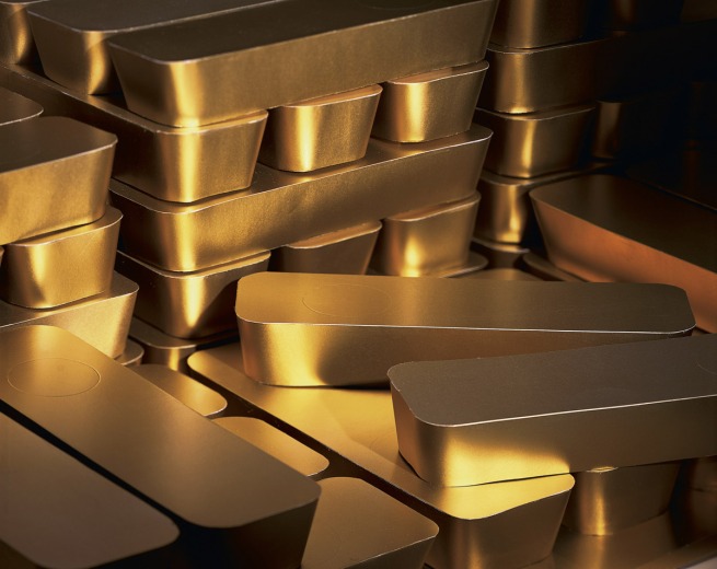
Bullion 2003
Thomas Demand German 1964- 'Bullion' 2003
taken from http://artblart.com/2013/03/11/exhibition-thomas-demand-at-the-national-gallery-of-victoria-melbourne/ for personal study purposes

Paper of gold… A little joke I think?

Less interesting when Walls work. Clever but in a different way. Are they photography, or instead a photographic representation of an artwork (sculpture?). Does it matter? All the errors/imperfections are made by him. Why is it different to taking photos of the actual space, devoid of people? What is the meaning behind them?

Like Wall, images are big prints, but they feel like the 'right' size.
The pseudo documentary style is interesting. Many or all of the scenes are based on actual locations, most are 'important' in some news worthy way… Is he commenting on the speed of news photography, the immediacy of it? The Impermanence (he generally destroys his sets)?

Other photos are of places the average person will never get to… The grotto, space simulator etc. others are comments on the technology… The bullion as cardboard, the CCTV camera watching you as you watch the video, the rain made of paper… interesting and playful twists on his chosen medium.

References:
http://artblart.com/2013/03/11/exhibition-thomas-demand-at-the-national-gallery-of-victoria-melbourne/
http://www.ngv.vic.gov.au/whats-on/exhibitions/exhibitions/thomas-demand