Saturday, 29 December 2012

Exercise: Enhancement

Aim: This exercise follows a simple process of altering a specific part of the image to 'emphasise' it. The ethics of this are then considered.

Procedure:
The initial shot exported out of LR (cropped slightly) is of my younger son, shot with ambient light through a window coming onto his face. 
SOOC version
Using LR's masking utility, I have selected the whole face area for alteration
red mask showing area of selection
The whole face is lightened using exposure and contrast adjustements. The face is more prominent than in the SOOC version
Whole face - increase exposure and contrast
Next just the eyes were selected for enhancement - this time increasing brightness and saturation just over the eye area.
Eyes only adjustment
Then I kept the eyes adjusted and just increased the exposure for the whole image, which is a more balanced image than the previous one.
Eyes adjusted and whole image with increased exposure
Finally we are suggested to alter the colour of the iris by changing the hue. I did this by selecting just the iris area with a mask and using the colour temperature to make the eyes more blue.
Adjusted eyes to make them more blue

Conclusions:
Well I feel quite comfortable with the whole face selection and adjustment. This is just simple dodge and burn of a large area. Once the area is getting quite a bit smaller and the adjustments are as clear as adjusting the saturation and brightness of the eyes, we are getting into dubious territory. The changes are quite significant, and while that is OK, it's also not reality... (though then we get into a discussion about what is reality?, is any photograph really real?, and is there any subjective imagery?)

I think changing the hue selectively is quite a major change, and ethically needs to be pointed out to the viewer/purchaser/whoever. But I do know that these changes (and others such as adjusting waistlines etc) are common-place in the magazine industry (though debatable whether the general public has such good awareness, though with the rise of the internet more people do know about it). I certainly wouldn't feel comfortable changing the colour of eyes with regularity without making it obvious...

I feel like this is a can of worms! Which is certainly why it is part of this coursework...

Wednesday, 26 December 2012

Becher: Typography (and a few others...)

Since I am planning on doing a large project photographing house fronts in a consistent manner, probably for Assignment 5, I need to do some reading and thinking about Typography and the photographic movement around it, mainly started by German photographers Bernd and Hillary Becher. I started online with my usual first port of call, Wikipedia and a Google search. A neat little article in American Photo magazine started me off, with a few interesting facts such as that they won a prize for sculpture at the Venice Biennale in 1991!  Their photos and groups of photos are undeniably beautiful, and in particular, the repetition and subtle differences are interesting and appealing to me.

Bernd & Hillary Becher, taken from http://www.americanphotomag.com/article/2011/11/instant-expert-bernd-and-hilla-becher for personal study purposes
I then went to my (growing) photo book library and pulled out a couple which I thought would be useful. Cotton (2004) is a great little reference for many different styles of photography, in this case the 'deadpan' chapter which contains a number of examples of typological photography which have previously fascinated me. 

Andreas Gursky - large scale images of the natural and man-made environments - pattern/repetition/colour all feature strongly... 'Through all his work runs a sense of impersonality' (MOMA, 2010), rejection of the truth of the candid image is underlined by his use of digital manipulation (MOMA, 2010) - interesting in relation to Part 4: Reality and Intervention

Andreas Gursky 99cent, taken from Wikipedia for personal study purposes


Martin Parr – I’ve always been a fan of his in-your-face photography, really shows life as it is, warts and all. The intense colour is achieved by on-camera flash, and his style is very distinctive and unique. Banal and beautiful.

Edward Burtynsky - I have his book 'Oil' which is particularly interesting to me as I work in the industry myself. It's a great book with large images from his long term project looking at various aspects of the oil industry and it's end product usage  though doesn't delve into the complex ways we use hydrocarbons in the  real world - more just looks at the typical car races and petrol pumps (i.e. ignores the pharmacological and medical and plastics etc).

Lewis Baltz - clean, industrial images with spartan colour palette - influential on a number of contemporary photographers  such as Gursky mentioned above. 'His work is focused on searching for beauty in desolation and destruction' (Wikipedia 2012)

John Riddy - architectural photographs which strike a cord with me for their tempo and simplicity

However, for example, I've never 'got' William Eggleston... I have two of his books, 'William Eggleston's guide' (2003), and 'For Now'(2010). Both evade me somewhat.

The Tate Modern show 'Cruel and Tender' would have been great to see (Dexter and Weski, 2003). However the book contains a number of large images, some in series, and there are also some essays at the start of the book.

Other artists I have recently discovered:

Corey Arnold: Documentary style photography with a funny side - yet also quite a serious capture of an unknown subject

Jeffery Milstein: Suggested by a friend, this photographer works in series, capturing everyday views (boats going under a bridge, airplanes overhead) and photographs them uniformly and presents them all together - a fascinating look at pattern and repetition.
Jeffery Milstein, taken from http://www.jeffreymilstein.com/index/portfolios.html for personal study purposes

Jeffery Milstein, taken from http://www.jeffreymilstein.com/index/portfolios.html for personal study purposes


Peter Wegner: Also really works in series, a photographer/artist/writer/everything! Prolific! Captures 'everyday' scenes/items and photographs them, and then presents in series. Interesting view.
A little obsessive?
Peter Wegner, Incidental Architecture, taken from http://peterwegner.com/work_detail.asp?id=189 for personal study purposes


Robert Adams: Photographer of the American west. 

Robert Adams, taken from artgallery.yale.edu for personal study purposes


More on this as I keep doing more research.

References:

Adams, R, (2012), Art Gallery Yale [Online], Available at: http://artgallery.yale.edu/adams/landing.php [Accessed 09/12/12]

American Photo Mag, (2011), American Photo Mag [Online] Available at: http://www.americanphotomag.com/article/2011/11/instant-expert-bernd-and-hilla-becher [Accessed 09/12/12]

American Photo Mag, (2011), American Photo Mag [Online], Available at: http://www.americanphotomag.com/photo-gallery/2011/12/books-year-corey-arnolds-fish-work-bering-sea?page=14 [Accessed 27/12/12]

American Photo Mag, (2011), American Photo Mag [Online], Available at: http://www.americanphotomag.com/photo-gallery/2011/12/books-year-brian-ulrichs-place-great-or-what  [Accessed 27/12/12]

Burtynsky, E, (2009), Oil [Steidl/Corcoran], Germany

Burtynsky, E, (2012), Edward Burtynsky Website [Online], Available at:http://www.edwardburtynsky.com/ [Accessed 27/12/12]

Cotton, C, (2004) The Photograph as Contemporary Art [Thames & Hudson], London

Dexter, E and Weski, T, (2003) Cruel and Tender [Tate], London

Eggleston, W, (2012) William Eggleston Website [Online], Available at: http://www.egglestontrust.com/ [Accessed 27/12/12]

Eggleston, W, (2010) For Now [Twin Palms], Santa Fe

Frieze Magazine, (2012), Frieze Magazine Online [Online], Available at: http://www.frieze.com/issue/review/lewis-baltz/ [Accessed 27/12/12]

Matthew Mark, (2012), Matthew Mark Gallery [Online], Available at: shttp://www.matthewmarks.com/new-york/artists/andreas-gursky/ [Accessed 26/12/12]

MOMA, (2010), MOMA Website [Online] Available at: http://www.moma.org/collection/artist.php?artist_id=7806 [Accessed 26/12/12]

Milstein, J (2012), Jeffery Milstein [Online], Available at: http://www.jeffreymilstein.com [Accessed 27/12/12]

Parr, M (2009), The Last Resort [dewi lewis publishing], Stockport

Phillips, S (2007), Martin Parr [Phaidon], London

Szarkowski, J (2003) William Egglestons Guide [MOMA], New York

Tate, [Online] Available at: http://www.tate.org.uk/download/file/fid/7229 [Accessed 09/12/12]

Tate, [Online] Available at: http://www.tate.org.uk/art/artists/john-riddy-11957 [Accessed 27/12/12]

Ulrich, B (2012), Not if but when [Online], Available at: http://notifbutwhen.com/ [Accessed 27/12/12]

Wikipedia, (2012), Bernd and Hilla Becher [Online] Available at: http://en.wikipedia.org/wiki/Bernd_and_Hilla_Becher [Accessed 09/12/12]

Wikipedia, (2012), Andreas Gursky [Online] Available at: http://en.wikipedia.org/wiki/Andreas_Gursky [Accessed 26/12/12]

Wikipedia, (2012), Edward Burtynsky [Online] Available at: http://en.wikipedia.org/wiki/Edward_Burtynsky [Accessed 27/12/12]

Wikipedia, (2012), Martin Parr [Online] Available at: http://en.wikipedia.org/wiki/Martin_parr [Accessed 27/12/12]

Wikipedia, (2012), Lewis Baltz [Online] Available at: http://en.wikipedia.org/wiki/Lewis_Baltz [Accessed 27/12/12]

Wikipedia, (2012), William Eggleston [Online] Available at: http://en.wikipedia.org/wiki/William_Eggleston [Accessed 27/12/12]

Wegner, P (2012), Peter Wegner [Online], Availabel at: http://peterwegner.com [Accessed 27/12/12]

Artist: Viviane Sassen


Viviane Sassen

I first came across the work of Viviane Sassen when reading a Photoworks magazine (2010) and was struck by the beauty of her images. They are a cross between portraits and fashion images, and I thought her use of light (and in particular shadow) was intriguing for fashion photography, and I really liked the bold use of colour and paint in her staged images (I think they are all staged actually).  Often her models are not identifiable – either by use of shadow or a hand over the face or facing away from the lens. They are also not typical in many ways – for example one image in the Photoworks magazine shows a person sprawled on the ground under the shady shadow of a tree. To identify the image as fashion (i.e. about the clothes or style?) is quite amazing! Her images are quite enjoyable and fun to look at (and I imagine to take), which seems at odds with what I know of the fashion industry (something I’m not particularly interested in to be honest).

Viviane Sassen, taken from http://www.vivianesassen.com/ for personal study purposes

Viviane Sassen, taken from http://www.vivianesassen.com/ for personal study purposes

Viviane Sassen, taken from http://www.vivianesassen.com/ for personal study purposes

Her work also graces the front cover of this month’s BJP (print issue December 2012), and also the BJP iPad App (Summer 2012), and I also think it features in the Hotshoe Magazine, though I have not received my copy yet. Her work is distinctive and different – she certainly knows her voice and style and works with it. I find the starkness and bold ideas (model bent back over chair/ head in water / use of mirrors and other simple devices) inspiring and I think it would be fun to try to incorporate into my work if I get the opportunity. I certainly plan on following her work.

Here is an image taken for my Assignment 3, which I think is quite ‘Sassen’ like…


References:

British Journal of Photography (2012), BJP December 2012 [Volume 159 Issue No 7807]

Photoworks (2010) Photoworks Spring/Summer May/October 2010

Sassen, V (2012), Viviane Sassen Website [Online], Available at: http://www.vivianesassen.com/ [Accessed 26/12/12]
Sassen, V (2012), Viviane Sassen Facebook Page [Online], Available at: https://www.facebook.com/viviane.sassen.3 [Accessed 26/12/12]
Tuesday, 25 December 2012

Exercise: Improvement or interpretation?

This exercise looks at using ‘darkroom’ style simple adjustments to images to emphasise a person within an image. I have chosen a photograph of my son in difficult conditions – he is in the shade and there is bright background behind. In order not to overexpose the background he is underexposed in the foreground.
Original unedited image
So I need to make a selection of him, in this case using Lightroom’s masking tool. I used a brush with a wide feather and then refined it afterwards using the ‘erase mask’ tool. I applied an increase in exposure of 1.14 for the part of my son in the shade.
Child selected using the mask tool in Lightroom (red highlight)
The result is below, and he is clearly more obvious now.
Exposure increased by 1.14 stops only on mask area
I then painted a mask over the goat which is also very dark in the foreground. I applied a +2 exposure and a +60 noise reduction to counter the increased noise on the animal’s dark fur.
Goat selection
The result is below and I think it is more balanced now. I think in retrospect I should have exposed for the boy in the foreground and let the background blow out.
Increased exposure and noise reduction over the goat
Finally I cropped the image.
Final cropped image
The above procedure could be replicated in Photoshop using slightly different tools.

The above is simply like dodging and burning in a darkroom. I think it’s quite a reasonable thing to do to an image, though of course it would be preferable to get it right in camera, but it is simply not always possible, and images need to be rescued sometimes. I think this time of adjustment is fine because we are simply adjusting exposure really, and it is really very similar to adding flash or lights or simply choosing different exposures of an image. I can’t really think of how extreme this could go, and how this could not be also done with flash or other selective lighting. 

Monday, 24 December 2012

Exercise: Correction


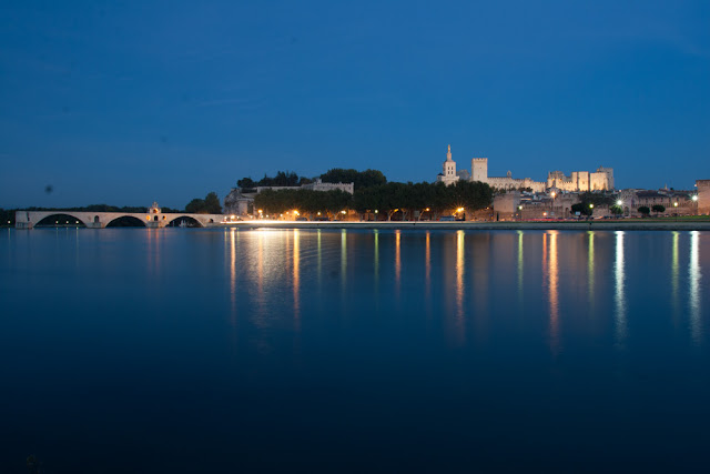
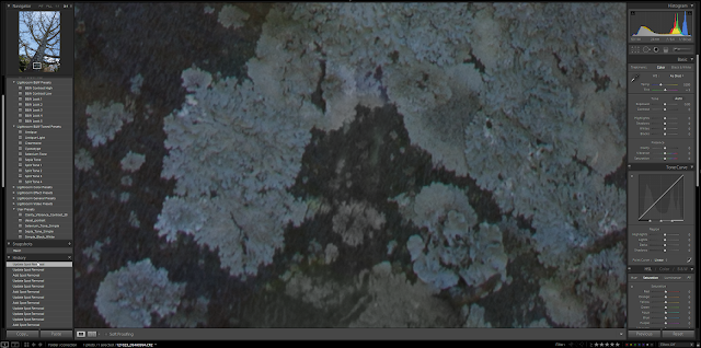
The first part of this exercises focuses on dust correction. I used to have much more of a problem with this, before I started cleaning my sensor myself. So I have delved into my archives for a great dusty image, taken in France on our roadtrip of 2007, in Avignon.
Image with many examples of dust spots clearly visible
The night-time conditions are particularly suitable for dust – long exposure against a clear sky and reflective water.

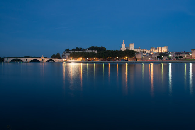
The dust spots were quite simple to remove, using the clone stamp in Lightroom. When zooming in at 100%, I also noticed a small bush in the lower left hand corner which I had not previously noticed! The dust marks were all quite obvious in this image, though I’m sure I have missed some on the buildings and other areas where it would not be possible to tell which was dust and which real. To be honest this does not bother me – I choose to remove things that I think should be removed, though I realise this is because my images are only created for me, not for journalistic or other purposes.
Dust spots were fairly quickly removed using the clone tool in Lightroom
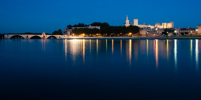
I also cropped and tweaked the image slightly and display below.

Image has been cropped, optimized and slight adjustment of curves in Lightroom

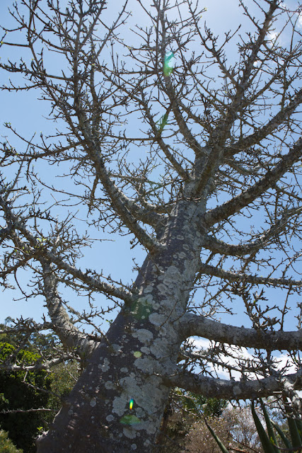
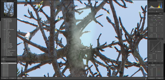
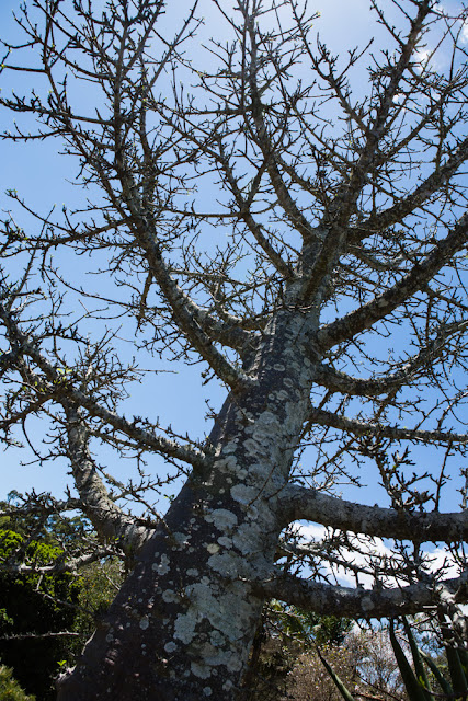
The second part of the exercise is looking at lens flare correction. I chose an image that I took recently at Mt Coot-ha Botanic Gardens specifically with this exercise in mind. The image is looking up at a large tree, with the sun behind one of the branches.
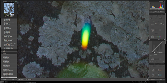
Lens flare down the centre of the image
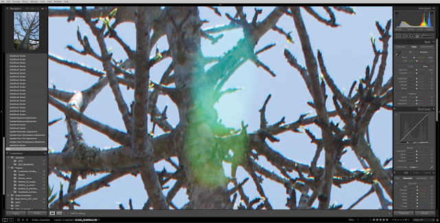
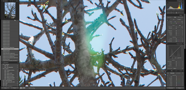
Most of the lens flare was removed relatively easily in Lightroom. I used an adjustment brush set to desaturation and underexpose by about half a stop or so (adjusted as necessary). This effectively removed most of the lens flare, for example on the trunk below.
Example of colourful lens flare on tree trunk

Desaturation has removed the colour effect

The clone tool finishes off the job

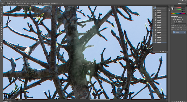
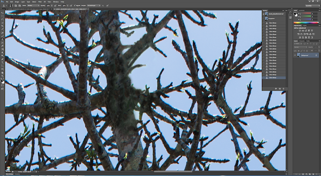
More difficult was the area at the top of the image which included some sky which was a different colour as a result of the flare, and some awkward to remove flare on the trunk – the trunk was noticeably paler than it’s surroundings. So I went into Photoshop with my image from LR and did some further adjustments using the clone tool. I set it to darken as suggested in the notes, and used it to adjust the colour of the sky and trunk. The result is quite convincing, though I can imaging it would be more difficult with other subjects (I recall seeing someone’s wedding photos with flare over half the wedding party’s faces – that would be a bit tricky!) I think it might be possible to remove using colour management – for example using tinting or colour balance in a mask, but I have not tried that for this exercise.
Difficult to remove flare on tree and sky
Desaturation works effectively on the trunk, but the exposure is still wrong
The finished result in Lightroom, but I know it needs further work with the tools of Photoshop
Bringing the image into Photoshop, and using the clone tool on the sky (to adjust the colour) and trunk
The finished product in Photoshop looks convincing even at this zoomed in scale
The finished result, optimized slightly in Lighroom (before it was taken to Photoshop) and all the flare removed.
Note that there are some other colour abberations on the trunks - are these considered flare? I don't know... I guess it's personal and needs to be considered depending on the use case for the image perhaps. it certainly would be difficult to remove for all the branches in this image!
Colour fringing on tree trunks - is this flare? 
I think in general it is best to avoid taking photos with flare if you don’t want to include it creatively. It can add to an image, but it is a bit painful to remove. In terms of what I think is ethical – if it is for personal use or if it is stated that there is some removal of photographic artefact then there is no problem. A problem may come about with use for journalism for example.

Thursday, 20 December 2012

Facebook Page

So after taking the photos of the farm and providing them to the manager of the nursery this week, I have had so many comments that I decided to set up a facebook page. I am not ready to create a dedicated website, but equally, if people want to know 'who took those photos' then at least they can see a bit about me and my work... At the moment I've put up the farm photos and a selection of nature images. I'll add some more soon, but it's a start...


References:

Wallace, S (2012). Selina Wallace Photography Facebook Page [Online] Available at: http://www.facebook.com/SelinaWallacePhotography [Accessed 21/12/12]
Wednesday, 19 December 2012

Assignment 3: How to process an image

How do I process an image? There are endless tweaks and adjustments and sliders to choose from, and that's only using Lightroom. Once an image is brought into Photoshop, then anything can be done. But that's not my point here. I am considering the treatment of one of the images in my Assignment set. It is one of my favourites, a little Viviane Sassen, with the 'model' partly hidden behind the tree. Not really (I would like to think so!!), but perhaps a little so (I will write about her work soon - I see it as very modern fashion photography, and I don't really think I'm very interested in fashion, but I think her work is wonderful!)

Here is the image in monochrome as I have presented it previously on this blog:


It's not simply a mono conversion, it's low contrast, optimized a little and had some other minor tweaks, but it's nothing fancy. I really like how the eye is drawn from the crates on the ground (put there to protect the young seedlings from being eaten by turkeys or possums) through the small tree to the man watering behind. I have chosen a central placement on purpose because he is hidden and thus not clearly otherwise the focus of the image.

When I viewed the colour version, I was reminded of how RED the crates are, and how much they dominate the image. It really changes the _feel_ and takes some of the subtle hidden nature away. It's still effective, but perhaps a bit too strong on the colour (supporting my premise for processing in black and white for this project - the colour really distracts). However, there is that Sassen feel again with the bright green hose pulling the viewers eye in from the left.


So then I began to think, should I use the red pallets more in the mono image - make them darker perhaps? This is done using the sliders in Lightroom. This is the result:


It's hard for me to judge because I have looked at the images so much I find it difficult to be objective, but now it feels a bit 'bottom-heavy' to me. I am leaning back towards the original but I'm unsure. I think the man becomes less important in this image, and really since he is the point of the photograph I think I should choose the version that highlights him the most.

References:
Sassen, V, (2012). Viviane Sassen Website [Online], Available at: http://www.vivianesassen.com/ [Accessed 20/12/12]

Tuesday, 18 December 2012

Assignment 3: The final eight

I have got my prints back and selected the best eight images from them, however I think out of these there are two weaker images (shown top right below) and these will probably be removed from the set before sending them to my tutor. They are displayed below (sorry for the poor quality), laid out on a whiteboard.

I am slightly concerned about using one portrait image and 5 landscape images. This was partly why I included the second portrait orientation image in the set. I am unsure if it is wise to have only one photograph of different orientation in the set. Unfortunately, I really like this image and think it is quite strong and provides good context to the set. I will need to think about whether to include it in the final set or remove it.

After getting the photos back from the printer I realized a couple were too dark and needed lightening. Those with Peta in them (white t-shirt) needed to be held back on the white t-shirt and the rest of the image lightened. This has improved the image as a whole. The photo of the man watering also looked too dark and when I looked at the histogram I realized the whole image had been pulled back too far and needed lightening. This was easily done in Lightroom. I have made some other spot changes to all the images and come up with the final eight, displayed below:


I also had one image printed with a white 5mm border, and I think this worked really well - finishes off the image nicely. If I am not going to mount my images then I shall put the border on. So now I need to decide if I mount my images on white card or not. I think it does present better than just prints, but I'd like to know what others do, so might do some asking around online. I plan to get these final eight printed this week so that I can do any mounting etc over the Christmas break.