Showing posts with label Part 4: Reality and Intevention. Show all posts

Saturday, 29 June 2013

Assignment 4: Feedback

I received my feedback this week for Assignment 4, which was, predictably, not as good as some I've had. I'm OK with this but take all the comments on board as points to improve from.

My main issue was, as my tutor pointed out, access to the subject. I probably should have realised that this was a problem and stopped trying to get the photo, but once I had it, I thought it was better than it was, and this was my problem! And once I had worked on it and edited it and put all the nice neat text on it, I thought it was good, when in reality it was only average. A learning point. It's never too late (except after submission!!) to admit that I am wrong about an image and just start over! But I didn't (although but submitting a second example of my work I was in a way hedging my bets!) and next time need to just consider that I need to only present my best work even if it means 'wasted' time.

Anyway, enough on that, the main issues were (apart from accessibility):
  • Take more photos, different angles/focal lengths/apertures/lighting. Spend more time just looking at the scene and thinking about how best it can be photographed.
  • Use a tripod
  • Don't use lenses at maximum or minimum focal lengths and apertures - they are not as sharp (I have read this before but should probably do some specific reading on my lenses perhaps?)
  • Don't crop too heavily (more than 25% of image is too much)

In addition,there is a green colour cast on the flower. I'm disappointed in myself for not noticing this... I am not particularly good at looking at colour casts on the screen, and as I look at the print next to me (which I should have printed prior to submitting the assignment, not afterwards), I can also see the cast. So I need to do more printing also, and be critical of the prints. Now that I'm based in Adelaide with an excellent professional printer a short cycle from my office, I should have no excuses for not doing more regular printing.

My 'design' is fine, though my tutor has some excellent advice for future design assignments which makes for interesting reading.

I also should perhaps engage in more specific technical research, and subject-specific contextual research. This I have done more for my final assignment, but need to remember it for all projects.

My 'alternative' image does not suffer from the same problems, so I will be submitting this one for assessment instead, though I have made some small tweaks to the colour/vibrance of it in order to liven it up a bit. I also toned down the colour of the text as my tutor mentioned that very vibrant text colours could be difficult for printing.

Adjusted image, Assignment 4
So, another the process continues. I hope to have more time moving forward for photography (now that the little one is bigger - almost 1!) and to be able to actually get out on my own occasionally to do some photography will be possible perhaps too. I take my tutors comments on board and will attempt to slow down more, still do more research, and take more care in composition in particular.

Wednesday, 22 May 2013

Assignment 4: Real or fake?


The aim of this assignment is to produce a cover for a imaginary book or magazine. I have chosen the cover of an Organic Gardening magazine, some examples of which are shown below (all sourced from Google images).


I have discussed in a previous post (here), some of the desirable aspects of creating a cover image, and I will mention a few more in this post also. I think simplicity is key. The image should hold one simple message, be it a beautiful chicken, a great example of a plant, or tasty healthy looking produce. The image needs to be simple with few elements. The focus should be on this one key part point and the rest of the image should just be supporting, i.e. a coloured, or out of focus background or complimentary in some simple way. Then the text around the image should fit in - similar or contrasting colouring, but consistent across the whole page. I am not a designer, so I have decided to just be very simple with my layout and design, but tried to think like a designer might.

I started out with two possible ideas, the first was a shot of a beautiful flower that I had been eyeing off in my garden. It only flowers once a year, for about a week, and is only at it's best for a day or two of that time. The light was soft (early evening), and the only viewpoint possible was from our balcony, so I took few a shots with my camera and 24-70mm lens.
Example of photos taken of the flower
The chosen image and resulting crop applied initially in Lightroom is displayed below. At this point I should say that I don't particularly think the image is very strong graphically, and definitely needs heavy cropping, which is not ideal (though my camera can cope). I decided to continue working with the image at this point because I thought it had some potential.

130114_054A316.CR2

24-70mm f/2.8 lens, Canon 5Dm3, f/6.7, 70mm, 1/60sec, ISO 125


Chosen image with initial crop displayed in Lightroom

I then took the image into Photoshop for further work. I processed the image using camera Raw. Highlights, clarity and vibrance were tweaked.
Processing in camera Raw
The image was brought into Photoshop as a smart object so that I could go back to the RAW processing if I needed to at a later point in the process. I decided that the background needed to be tidied so that any small light patches didn't show through, the spider web on the leaves needed to be removed, and some dusty looking patches removed also.


The starting image in Photoshop
Zoom in on spiderweb that needs removal.
The clone tool and heal tool were the most useful for removal of the spiderweb.
A light spot in the background is removed using the clone stamp
I removed many distracting light spots in the background and foreground, but tried not to be over-sensitive, that is, take out the natural beauty and character of the leaves. I feel like the changes I made were fairly minor, and acceptable as part of 'tidying' up the image. If I had access to a large ladder, I could have gone and actually cleaned the leaves of spiderwebs etc myself, though I could not have removed the bright spots, this could have been done in a darkroom by a talented practitioner, so I feel like these changes are ethically acceptable.

The resulting image is shown below on the left, compared with the image on the right which is the same but without the clone layer visible.
Compare with clone layer (left) and without (right)
The image on the left is somewhat 'cleaner', though at this scale the differences are hard to see. I have removed some distracting objects around the edge of the frame, and also the brown leaves in the lower centre of the frame have been removed to make it a bit cleaner.

No other selective editing was done. I thought the flowers had quite a bit of 'pop' already, and didn't need any more editing to enhance them. The background leaves were nicely darker, and the foreground leaves are bright and full of lively colour.

Finally, I chose a colour palette, and decided on a title and some appropriate words for my magazine cover. I decided to pick up on the strong green and contrast it with Red lettering (also picking up on the fact the magazine was the December (Christmas) issue. The final magazine cover is presented below.
Final magazine cover

In addition, I decided to try shooting a still life with a heritage tomato, as an alternative. The cover is shown below, but I don't feel it is as effective as the flower above, which is fairly unique and special, in that it only flowers once a year. The still life is a bit more of a cliche. In this example, I needed to tidy up the tomato, extend the chopping board into the foreground, make the grey background a bit more continuous and extend it up also. I also used the colour picker tool to choose my font colours for this example. I used natural window light with some baking paper on the benchtops (for a neutral background) when taking the images (some examples are shown below).
Possible images for the tomato cover


Alternative magazine cover
Conclusions:
This assignment was challenging for me because I was very unsure what to shoot and how to choose a subject. Once I decided what genre to follow (by researching different magazine styles), this helped me to hone in on an appropriate subject. I tried a few different options and practiced some Photoshop editing techniques in the process. However, this is not a particular passion for me, so I decided not to agonize any more and simply present the magazine cover as it stands. I am unsure if the flower image is strong enough to present for an assignment, but as it looks on the cover I feel it is quite appropriate. I decided to try the tomatoes so I could have a second option, but I feel like the idea is a bit cliched. Overall, I think both covers are effective and would 'sell' magazines, that being the aim of the assignment, I feel like I have been moderately successful.

Ethically I feel like I have not pushed the boundaries with either image presented above. Cleaning up leaves and removing hot-spots is not particularly controversial and has not actually changed the final image very much at all. Nothing major was removed or added. So I am very much down the 'real' end of 'real or fake' for this assignment, mostly because that is where my interest lies.

Saturday, 12 January 2013

Assignment 4: Magazine cover musings

I have been thinking more about Assignment 4, which is my next challenge. I was in the Post Office picking up my new GorillaPod Tripod for our road-trip (more on that another post) and I had a few spare minutes to browse the magazine section. I can hardly believe that there are so many different types of magazines! I have never been a magazine person, only generally buying one on holidays, and haven't done that for a long time! I now buy digital mags occasionally, and subscribe to some Photography related magazines but almost never look at them otherwise (except at the hairdresser!).

So below are the types of magazines I may be interested in creating a cover for:

  • Caravan/camping magazine
  • General travel magazine (for example Lonely Planet)
  • Organic Gardening
  • Gardening Australia
  • Kids/Toddlers
  • Pregnancy
  • Sport/fitness/health (Womens)
  • Cooking
  • Technology
  • Art/Design
  • National Geographic
  • Science


Thinking about what sells magazines. The cover must be attractive, simple and make people want to buy the magazine!! That is the main aim of the cover. For example, the food/produce must look good enough to eat, the people attractive, beautiful (yet attainably so?) and generally both must be 'blemish-free'. For the technology, it has to look interesting/colourful yet nerdy and complicated. The Art/Design category has to be perfect - lines/shapes and everything totally in order. The travel images need to make people want to hop on plane/boat/car to get there, taken in perfect weather and with everything 'just-so'.

After thinking about the above paragraph, I can certainly see why Photoshop (or equivalent)  is a must for creating a cover. It is simply very difficult to create that kind of perfection in camera, particularly when dealing with food/people/fruit/vegetables/other objects. So even if it's a bit of touch-up here and there with the spot tool, or removing whole elements to simplify the scene and focus on the subject, it is almost necessary (and probably assumed by most people that it happens) to create a successful cover. A carefully set up still life might fit the bill for an image that needs very little touch-up, but that would be quite challenging.

I've seen a video before showing how images are taken for advertising, for example, a burger for one of the big chains. It is cooked, then assembled in front of the camera and lots of images taken during the process. Sauce and mustard are syringed in place and a blow-torch used to very carefully melt the cheese in all the right places. It required a team of at least 10 people just to get a good image. That certainly explains why the image on the package never looks anything like the squashed, assembled in a hurry item in the box! And that doesn't even consider the various post-processing routines that certainly take place. I think it's common with food advertising that multiple images are taken and then combined afterwards, rather like the Addition exercise. We had some photos taken of our house to sell it, and the photographer took multiple images of each room, pointing the flash in different places and with different exposures to get the windows right and then the inside right, and he said he then combined them in post, so it's a pretty common technique now.

So now I've had a good think about what sort of magazine cover I would be interested in photographing, now I need to actually think about what to capture. I am leaning towards the Organic Gardening area - this is a personal area of interest, and with the farm over the road there are lots of willing people who may be able to help out with posing etc. There are chickens too who may be happy to photographed! A search on 'organic garden magazine' on google images comes up with some good ideas!

I'm thinking:

  • healthy plants
  • tasty looking produce
  • worn hands or gloves
  • well used sturdy garden equipment
  • happy chickens
  • still life with some good looking produce (with stalks on?)
  • fruit growing on trees
  • Heirloom fruit/veg (tomatoes and zucchini are the most common)
  • some rare kinds of fruit/veg
  • An actual, beautiful garden - trees/plants/paths/pond/buildings
  • fruit in a bowl/cloth bag/basket
  • herbs/spices - bundles on a wooden table
  • sunflowers
  • hands on plants - shows that it's 'home-grown'
  • person holding happy chook
  • sliced fruit/tomatoes
  • colour/shape very important
  • bowl of berries


I need to try taking some photos now and then see what we've got that's suitable for a starting image(s).

References:

Google

Friday, 11 January 2013

Exercise: Addition

Aim:
Adding elements from one image to another, in this case the fairly simple method of replacing a sky.

Procedure
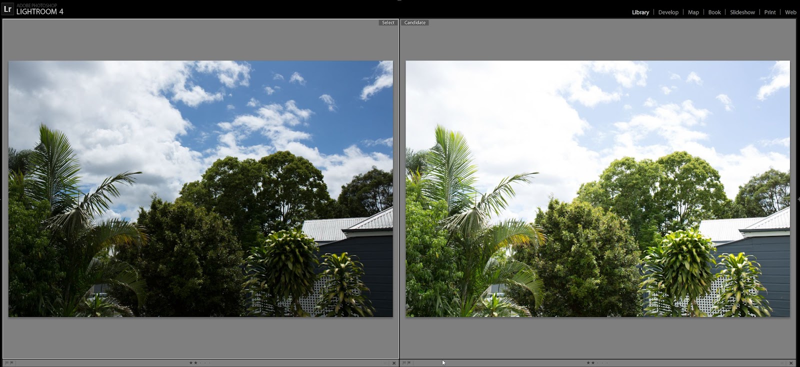
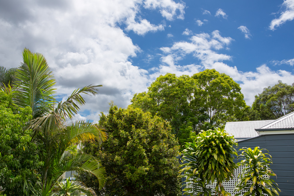
Same scene, two exposures - one for the landscape, one for the sky. The difference may be one or two stops.

Bring the two images into Lightroom, and then open in Photoshop.
Two images, left exposed for sky, right exposed for landscape
We are advised to not do any highlight recovery, though I did do a little just for the roof which was slightly overexposed in the right hand image.

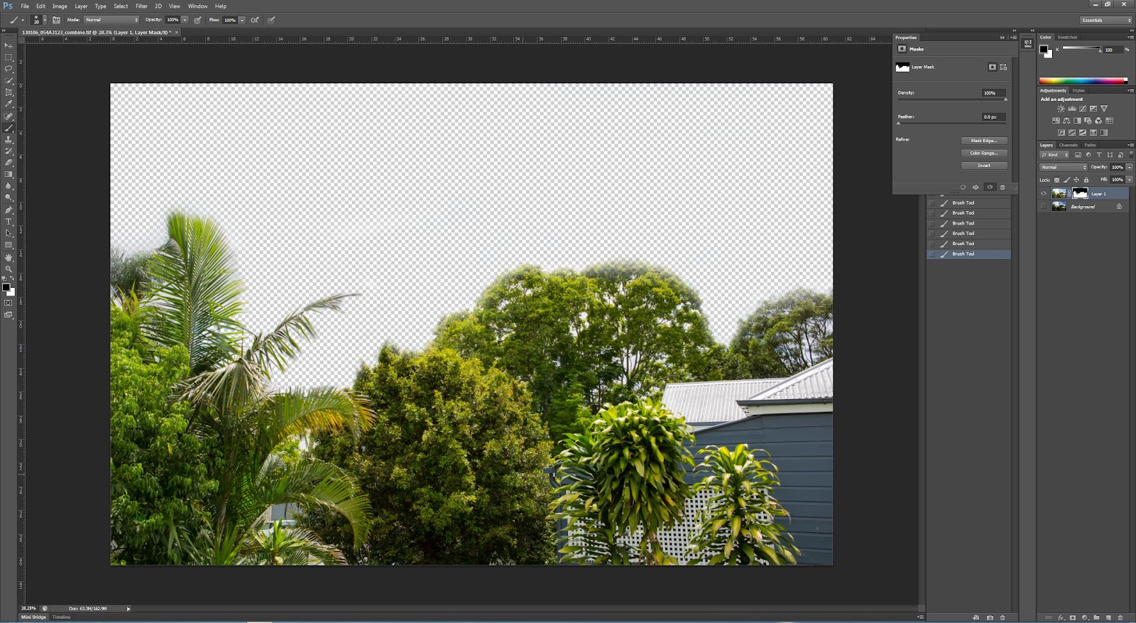
First erase the sky in one (I used a layer mask drawn with a soft brush). In the image below you can 'see through' the layer:
sky erased using the mask option and a soft brush
This is the resulting image
Image created from masking the overexposed sky using a brush
There are some small artifacts particularly amongst the various tree branches.

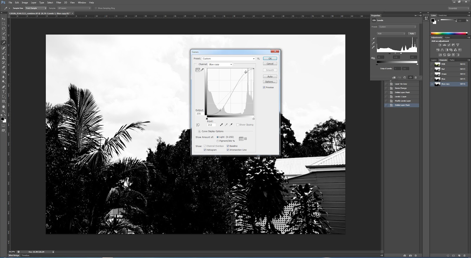
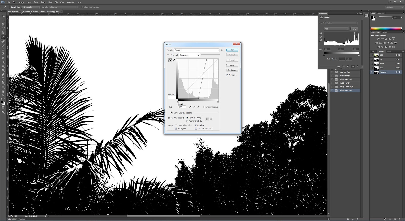
Then I used the Blue channel to create a layer mask.
Copy blue channel to a new alpha channel. Then Image > Adjustments > Curves to make it strongly black and white (vertical line of curves).
Copied blue channel with first curves adjustment
Copied blue channel with near vertical curves adjustment, zoom in on sky area to show detail in between leaves
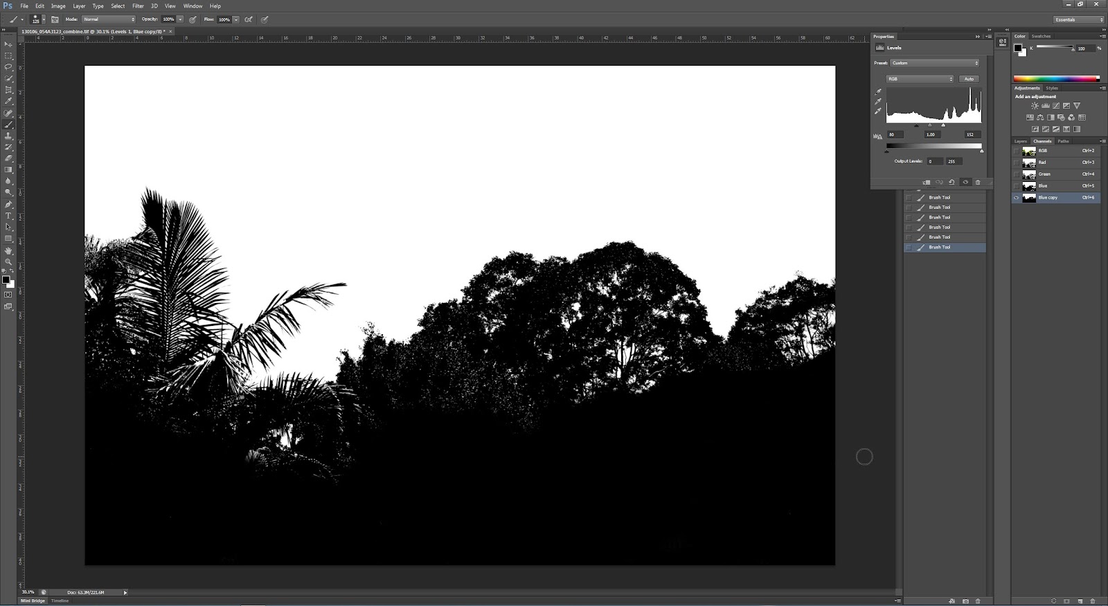
Then paint with black brush the areas in the foreground I want masked out.
Erased areas in bottom half of image that are not part of the mask using a black brush
Then with copied blue channel active click on the dotted circle at the bottom, and invert the selection. Then with the Layer 2 active (the sky layer) click the ‘add mask icon’ at the bottom of the layers panel. A much more detailed mask and quicker also.
Combined image using more detailed selection mask
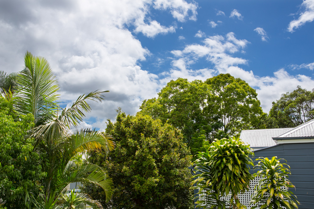
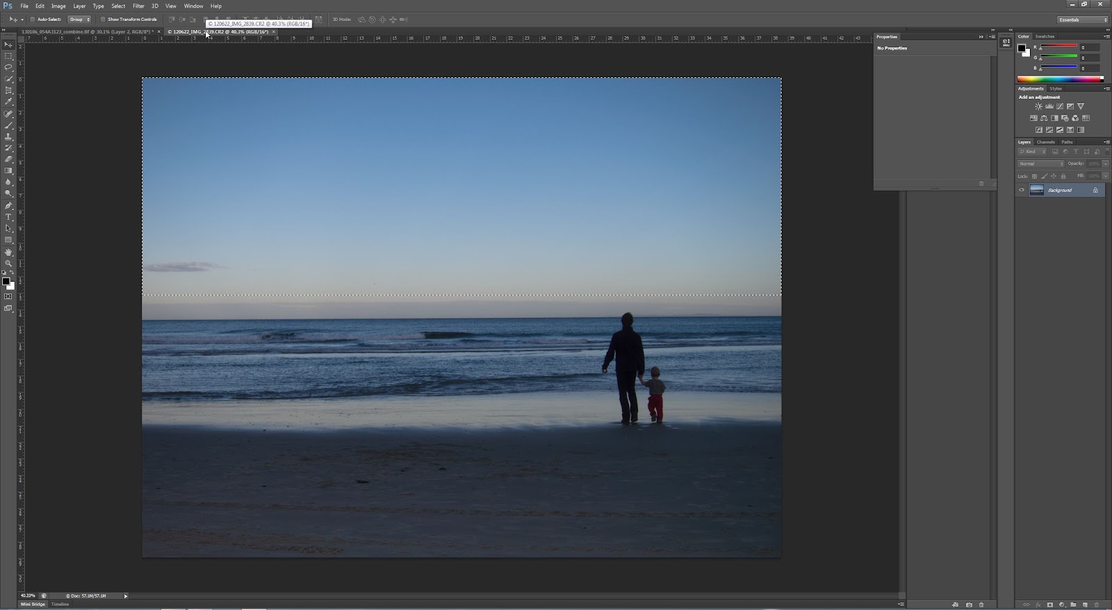
Next, choose another sky from another photo. Copy the sky, paste as new layer and place behind the layer 2 so that it shows up above the background layer. I just chose a simple blue sky, as it is the technique we are focussing on here. The colours roughly match those from my landscape image, and I just stretched the sky down to fill the whole area. When doing this technique it's important to look at any reflections (i.e., if replacing a blue sky with a dramatic cloudy image there may be blue reflections on some objects which need to be adjusted) and also consider the direction of light.
Image where i have taken the blue sky from
New sky added using same technique with channels to create mask
Conclusions:
I have learnt a few new Photoshop skills whilst doing this exercise. Selecting using the channels seems to be much more detailed and better for this exercise. I think I will definitely use this technique again for other images.

As for replacing a sky - I think the first example is quite reasonable - a kind of simplified HDR without all the fancy technique - fairly justifiable ethically. The second is a bit more dubious - replacing a large part of the picture with part of another picture, in this case from somewhere no where near the original is somewhat dubious. I think this is not really ethically sound for most kinds of photography apart from where it is clearly stated that there are large parts of the image that have been replaced. However, I know not all photographers will agree with this and they may think that it is fine. A spectrum of possibility...

References:

Better Photoshop Techniques Magazine, Issue 29 2012

Wednesday, 2 January 2013

Assignment 4: Thoughts

Aim:
The object of Assignment 4 is to produce a photographic image to illustrate an imaginary book or magazine cover (ideally portrait format then?). I need to decide on a topic, and then think about how to get the theme or story across to a prospective reader (some thoughts below on this). I need to consider the areas of adjustment and manipulation and how they contribute to the successfulness of the cover (making the object stand out by fading/desaturating/darkening the background, or brightening the subject). Juxtaposition is a possible idea (combine two or more images together). Obviously this all has to be accompanied by some thoughts and notes and importantly for this assignment, my ethical justification (suggested by the previous exercises on manipulation degrees). Prints must be sent again to my tutor.

A few ideas:
Each of the ideas below have differing levels of (Photoshop) complexity and levels of manipulation.

  • Out and out manipulation - e.g. a vampire image would make a good cover for a book for this genre, and would be fun. However it's not really an area of interest, and photographing people is not my strong point.
  • Or something patterned - use one element from one image and copy/paste/rotate it to make a new pattern - something chaotic, or fractal, or something along these lines - this could be the cover of a photography or design magazine. This will test my Photoshop skills and has the chance of being a bit cliched.
  • A pseudo-infra-red image - this is an area of interest for me (I have thought to convert my 30D at some point) could be used for a car magazine, or a camping magazine perhaps. Might be worth a try.
  • A more simple manipulation of a skateboarder jumping off some steps or something similar - capture him/her flying through the air and then combine it all into one image - this would be good for a youth style magazine. Once again, not really my area of interest, and I can't think where I could take such photos easily.
  • Front page of a Real Estate magazine - continue with the theme of houses and photograph the front of a house and combine different images - perhaps times of day, or simply remove any unwanted features and 'brighten' it all up to make it look posh and clean (remove blemishes etc), or add in a new sky for example? This is a possible one. I could start playing with some of the images I have taken for Assignment 5 as a starting point.

Resources:

  • Practical Photoshop magazine often has some examples of manipulated images. I have some editions on my iPad which I will peruse some time for ideas. 
  • Hotshoe, Photoworks and BJP are less focused on this area, so will be less useful, though they do always have other interesting articles, and sometimes discuss the ethical side of manipulation.


Finally:
This is a new area for me. I have never before tried to do any of the above ideas, so it's sure to be fun! I plan to do some more magazine reading to get some ideas and start trying things out. I'm sure my Photoshop skills will let me down, so I shall be doing some reading (and video watching) on CS6 also trying to make sure I know what more of the buttons do!

Exercise: Alteration

This exercise is all about full-on alteration of an image.

Aim: The aim of this exercise is to totally adjust an image to remove a major element from the scene. Tools which can be used are mainly those in Photoshop - this is a job for the big guns! Although not specifically discussed in the notes, I guess we are meant to consider the ethics of this sort of change to an image.

Procedure: This goes beyond anything I have ever attempted in Photoshop before, and thus was a bit daunting. I have chosen one of my 'rejected' images for my houses project. This image was rejected because it has a car in front of the house and I found it too distracting. I did however really like the bright yellow fence out the front and the contrast with the red brick walls and blue sky. So I decided it was a good image to attempt this exercise.

Here is the starting image. I have chosen to remove both cars, or attempt to anyway!
Starting Image
I made some minor adjustments (black/white points, clarity, vibrance and contrast, in keeping with the other images in this set) in Lightroom before opening in Photoshop.

I decided to start with the easiest part, which I thought was the wall.
Starting with the wall
There are some bad repetitions in the wall, but I decided to just do gross changes first before tidying up later on. In the screenshot below, most of the wall is done and I have concentrated in the detail near the bush.
Editing near the wall and bush
Next I worked a bit more on the car, and also on the foreground where there is clear repetition of the grasses. I am mostly using the clone tool for this exercise.
Foreground

more work on the foreground
I then did some work on the wall and stair area which I was aware could be the hardest part of this exercise.
Started work on the stair area
The stairs did prove tricky but I feel like i managed to get a reasonable result. I then finished tidying up near the intersection of wall and plant and stairs.
Tidying up near the top of the wall
I needed to fix up the stairs which I had made a mistake with, (kept the bit under the stairs aligned vertically instead of following down stepping out to the left of the image). This was easily fixed.
Working on the stairs
 Here I have basically finished the stair area.
Almost there with the stair area
Next I removed the car on the right - the fence palings were quite easy. I then copied the LHS of the driveway, flipped it and placed it on the right, making a few changes and then adding in some more grass with the clone tool etc. I am quite pleased with how easy this change was.
Removing the moving car on the right, and making the RHS of the driveway and fence area
The rest of the car was removed and the repetition was fixed to some extent, though there is still some repetition in the image. I think with further practice this would be possible to remove but I have decided to draw a line under this exercise at this point.
Rest of the main car removed
The final step was to use the crop perspective tool to straighten the verticals of the image and call it finished.
The starting and finishing images are shown below:
Starting Image

The finished image, also straightened using the crop tool in Photoshope

Conclusion:
When I started on this exercise I was a bit overwhelmed with the task ahead. However I soon realised the power of the clone tool and what could be done with it. The final image is by no means perfect, there are too many repetitions, and if you really zoom in then there are clearly areas where the cloning work is not very good. However, this is not really my area of huge interest (photo manipulation), and whilst it is good to know how it's done, it's not really worth me spending too long on for this exercise. I think at first glance I have achieved the objective, though with closer scrutiny there are areas where I could improve (had I the time or inclination).

Ethically, this is obvious major photo manipulation and certainly would not be acceptable for documentary work, or even landscape/nature photography. I recall a World Press Image a few years ago which had a major element removed with great uproar around it. And a landscape image just last year which was removed from the competition (after winning it strangely) which had had 'too much Photoshop work applied'. Strange how it could get that far in the competition without that being picked up on though... Anyway, this is clear manipulation and needs to be presented that way.

Saturday, 29 December 2012

Exercise: Enhancement

Aim: This exercise follows a simple process of altering a specific part of the image to 'emphasise' it. The ethics of this are then considered.

Procedure:
The initial shot exported out of LR (cropped slightly) is of my younger son, shot with ambient light through a window coming onto his face. 
SOOC version
Using LR's masking utility, I have selected the whole face area for alteration
red mask showing area of selection
The whole face is lightened using exposure and contrast adjustements. The face is more prominent than in the SOOC version
Whole face - increase exposure and contrast
Next just the eyes were selected for enhancement - this time increasing brightness and saturation just over the eye area.
Eyes only adjustment
Then I kept the eyes adjusted and just increased the exposure for the whole image, which is a more balanced image than the previous one.
Eyes adjusted and whole image with increased exposure
Finally we are suggested to alter the colour of the iris by changing the hue. I did this by selecting just the iris area with a mask and using the colour temperature to make the eyes more blue.
Adjusted eyes to make them more blue

Conclusions:
Well I feel quite comfortable with the whole face selection and adjustment. This is just simple dodge and burn of a large area. Once the area is getting quite a bit smaller and the adjustments are as clear as adjusting the saturation and brightness of the eyes, we are getting into dubious territory. The changes are quite significant, and while that is OK, it's also not reality... (though then we get into a discussion about what is reality?, is any photograph really real?, and is there any subjective imagery?)

I think changing the hue selectively is quite a major change, and ethically needs to be pointed out to the viewer/purchaser/whoever. But I do know that these changes (and others such as adjusting waistlines etc) are common-place in the magazine industry (though debatable whether the general public has such good awareness, though with the rise of the internet more people do know about it). I certainly wouldn't feel comfortable changing the colour of eyes with regularity without making it obvious...

I feel like this is a can of worms! Which is certainly why it is part of this coursework...