Showing posts with label Exercise. Show all posts

Tuesday, 2 July 2013

Project: A web gallery


There are two main considerations when creating a web gallery, as we are advised by the course notes. Firstly, the preparation of images for on-screen displays, and secondly, designing the viewers experience of visiting the site to best show off the images. The selection of images is important – only showing the best images, and also, presenting them central on the webpage – the image comes first!

I am starting by looking at other photographer’s web galleries, firstly looking at some fellow students work, for two reasons. Firstly I aspire to be like some of them, and secondly, they are on a similar pathway to me (though possibly further along), and so I can relate to them. So I started with Duncan Astbury whom I met when I lived in Edinburgh. His work is professional and his website looks well designed. Here is a screenshot:


It clearly shows his main interests, and specialities. The images certainly are central and the text is simple and surrounds the images complementing them. I probably wouldn’t overlap images, but that is simply personal preference.


Next I looked at the work of fellow DPP student Nathan Adams. He details on his blog (http://dpp.nathanadams.org.uk/2012/07/exercise-web-site-portfolio.html) how he designed his own website, the splash page which I show below


It is a strong starting point, a bold clear image with strong subject, supported by simple text of the photographer’s name. Upon clicking ‘Enter’, the viewer comes to another clean simple screen where the image comes first:


The thumbnails down the bottom are clear, and easy to click on to view at a larger size. The text on the left is simple, and does not dominate.

Keith Greenough was next, and his site keithgreenoughphotography.co.uk was also simple and clean, which I liked. The images pan through showing one scene at a time from each of his ‘portfolio’s’ which are displayed on the right side of the screen. It is simple and effective. Each portfolio can be clicked on to open a set of images. I thought each one took a little long to load for my liking, this would depend on internet connection partly, but is a consideration.

I also looked at Gavin Gough’s images, whom a fellow student had linked to. His images are mostly Asian travel theme, which must be his personal interest. The images fill the area and the text is very simple. I liked how he had the ubiquitous facebook/twitter/share symbols on his page.

I’m a big fan of the work of Viviane Sassen’s work. Her webpage has a rolling view of images, each highlighted in turn depending on where the mouse hovers over the screen. I find it a little distracting, but it does show her variety of strong images and might keep people on the site a bit longer, to see ‘what is coming next’! Her work is so distinctive and unique.


A slightly different slant for my final choice – Douglas Ethridge is obviously quite a widely published photographer, so his website has more detail of books, news and events. The layout is simple and highlights his key recent achievements.


So after looking at the above (and many other) websites of photographers, I will make some generalisations:


  • What is the purpose of the website? This varies depending on the photographer – art/commercial/student etc Make it appropriate!!
  • The most effective sites are SIMPLE! – in design/layout and information content
  • The images must stand out – and only the (very) best should be included
  • Easy navigation is also important – the average person only spends a few seconds looking at a website, so the whole thing must come together effectively and easily.


At this stage I do not plan to set up a website for my own photography. I am not interested in getting commercial work and do not have a coherent body of artistic work that I would be happy to put up – this is all in the future I hope! Nonetheless, an interesting exercise.


References:
Adams, N (2013), Nathan Adams Photography. Online, available at: http://www.nathanadams.me.uk/ [accessed 2 July 2013]
Astbury, D (2013), Astbury Photography. Online, available at: http://www.astburyphotography.co.uk [accessed 2 July 2013]
Ethridge, D (2013), Douglas Ethridge Photography. Online, available at: http://www.douglasethridge.com/ [accessed 2 July 2013]
Gough, G (2013), Gavin Gough Photography. Online, available at: http://www.gavingough.com/ [accessed 2 July 2013]
Greenough, K (2013), Keith Greenough Photography. Online, available at: keithgreenoughphotography.co.uk [accessed 2 July 2013]
Sassen, V (2013), Viviane Sassen. Online, available at: http://www.vivianesassen.com/ [accessed 2 July 2013]
 

Monday, 27 May 2013

Exercise: Sharpening for print

The aim of this exercise is to see the effect of sharpening on an image. This is a good exercise for me as I have not really toggled much with the sharpening, and certainly don't know about the differences between sharpening for screen or print, except that there is a difference!

I have chosen a reference image, as suggested I have chosen a portrait image, shown below with no sharpening applied (at this point I note that Lightroom by default does apply sharpening). I have zoomed in (using Photoshop Raw) over an area of the original image, where at 100% it about fits the size of my print at 8 by 10. I was unsure of how to otherwise 'print at full size', as this is a bit vague, depending on camera resolution and DPI etc.

What is sharpening?
I decided to do some reading about what sharpening is, and why it is used. It is used differently depending on if a print is for screen or print, and probably also depending on what paper it is printed on (eg newspaper vs gloss vs canvas or other materials). I found the following information on a fellow students blog which I have copied below to help me out:

Screen-shot_Details Amount Slider: This slider allows regulating amount of sharpening; setting the value to 0 can turn off the sharpening. Depending on the amount specified, the contrast between varying pixels increases. This creates the illusion of the edges being sharpened.
Radius: Regulates the area to which sharpening is applied (outside the perceived edge). It is like the feather effect of “Photoshop”. Need to use this slider judiciously; otherwise it can produce strange effect.
Detail: This slider adjusts how much sharpening will be applied on the details of the image. Smaller number will be restricted towards the edge, where as a higher number will affect greater details. This slider can help to bring out the texture. However, there is a risk of increasing the noise in an image.
Masking : This is the most practical and nifty feature. It masks the area that does not require sharpening. It is similar to the mask tool in Photoshop however; it is not as controlled.
 Taken from http://ocastudynotes.wordpress.com/2012/05/16/775/ for personal study purposes

I should note that it is important not to over-sharpen as this can introduce noise into images (an interesting article in Wikipedia). And to always observe the changes when zoomed in, at or around 100% magnification, to see the effects properly.

The sharpening was actually undertaken in Photoshop, but the same RAW engine is underneath both programs, so I won't investigate any differences in the two software packages (there shouldn't' be any!). I have not done any other editing.

no sharpening applied
The next image has 'mild' sharpening applied (settings below also).
mild settings of sharpening
settings for mild
The next image has 'medium' sharpening applied
medium settings of sharpening
settings for medium
The final image has 'heavy' sharpening applied
heavy settings of sharpening
settings for heavy
The differences are really only noticeable when zoomed in on screen, but they really are there! I mostly concentrated on the eye area, as this is where the camera was focused and should be nice and sharp.

I then uploaded the four images to a new site, Atkins Technicolor, which is based in Adelaide (where I now live) for printing. I have had some prints done there before, they are somewhat expensive, but a professional printing lab and I know that they will be high quality. I would like to use them for all my final printing for my work from now on, despite the costs. The advantage is I don't have to pay for postage and can just visit them in a lunch-break from my office, thus being moderately convenient. I note that we are meant to have a printer for this course. We don't own one and never have, and I must admit I don't really want to start fiddling with inks and having a huge printer in my work area, so I am going to avoid it for now and if it becomes an issue in the future I will deal with it then. I can't imagine every single OCA student has a printer at home...

Once I had the prints at home, I observe the differences...

Firstly I compared each print with the other. The 'none' version does look quite soft, particularly when compared with the others. The 'mild' and 'medium' both look good - the eyelashes are sharp and there is some texture on the cheeks and nose but not too much generally. The 'heavy' is noticeably sharper all over, probably to the detriment of the image, with there being too much sharpness on the cheeks and nose which should be softer. This could probably be controlled with the 'masking' option in Lightroom and Photoshop, which simply masks out continuous areas so they are not sharpened. 

When comparing between the print and the screen, I think the print can handle more sharpening than the screen image. This is probably because there is some slight matte-ness to the paper that 'absorbs' some of the sharpening? The 'heavy' for example, in print, just looks a little too sharp, whereas on the screen it is quite obviously over-sharp. I would probably choose the 'medium' for my selection in print form, whereas I would choose the 'mild' for the onscreen version.

Conclusions:

I think that the amount of sharpening required will vary for different scenes - perhaps a landscape print will need different sharpening to a portrait and so on. Something that should be tested before any large scale prints are made perhaps? The prints are more 'forgiving' than the screen for sharpening, so perhaps I should apply slightly more sharpening for printing than for on-screen images. Generally though I don't use much sharpening, just stick to the default for Lightroom ('mild' in my testing above) which seems to do a good job generally. It's always possible to sharpen more later, but removing sharpening is less easy!!

References:

http://www.atkins.com.au/tkins-prints-online/ [Accessed on 24/05/13]

Wikipedia (2013), Unsharp masking [online], Available from http://en.wikipedia.org/wiki/Unsharp_masking [Accessed on 27/05/13]

Madhvee Deb (2012), OCA Learning Log [online], Available from http://ocastudynotes.wordpress.com/2012/05/16/775/ [Accessed on 27/05/13]

Friday, 11 January 2013

Exercise: Addition

Aim:
Adding elements from one image to another, in this case the fairly simple method of replacing a sky.

Procedure
Same scene, two exposures - one for the landscape, one for the sky. The difference may be one or two stops.

Bring the two images into Lightroom, and then open in Photoshop.
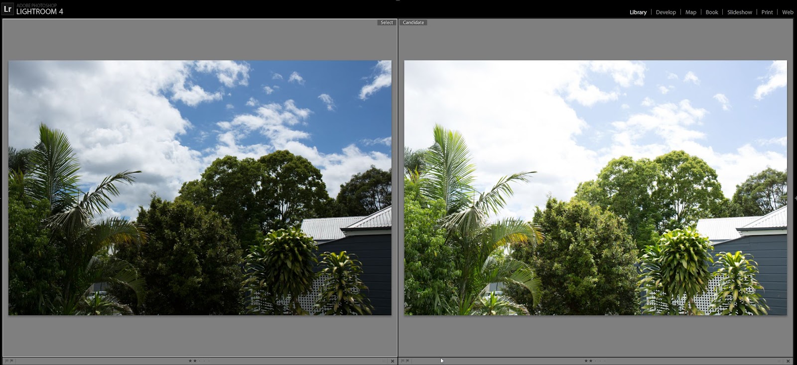
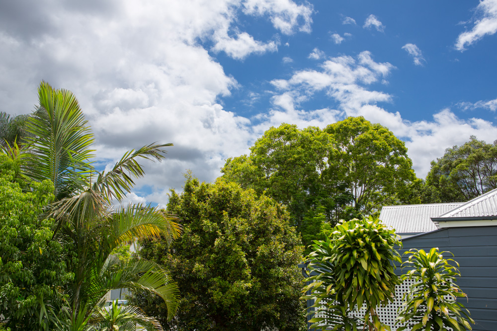
Two images, left exposed for sky, right exposed for landscape
We are advised to not do any highlight recovery, though I did do a little just for the roof which was slightly overexposed in the right hand image.

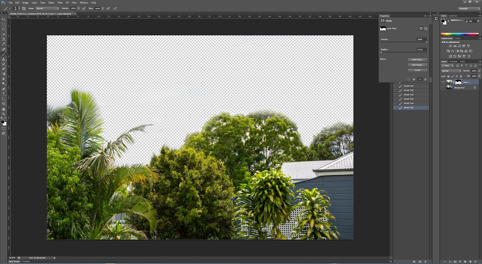
First erase the sky in one (I used a layer mask drawn with a soft brush). In the image below you can 'see through' the layer:
sky erased using the mask option and a soft brush
This is the resulting image
Image created from masking the overexposed sky using a brush
There are some small artifacts particularly amongst the various tree branches.

Then I used the Blue channel to create a layer mask.
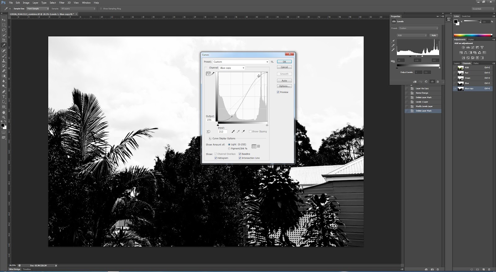
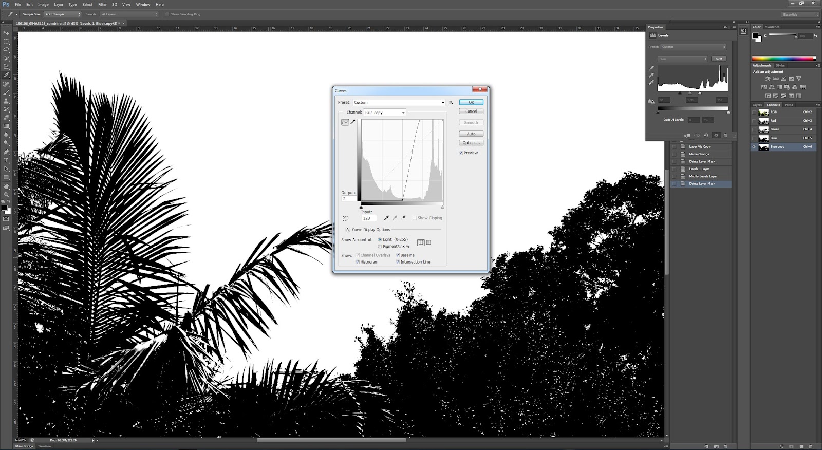
Copy blue channel to a new alpha channel. Then Image > Adjustments > Curves to make it strongly black and white (vertical line of curves).
Copied blue channel with first curves adjustment
Copied blue channel with near vertical curves adjustment, zoom in on sky area to show detail in between leaves
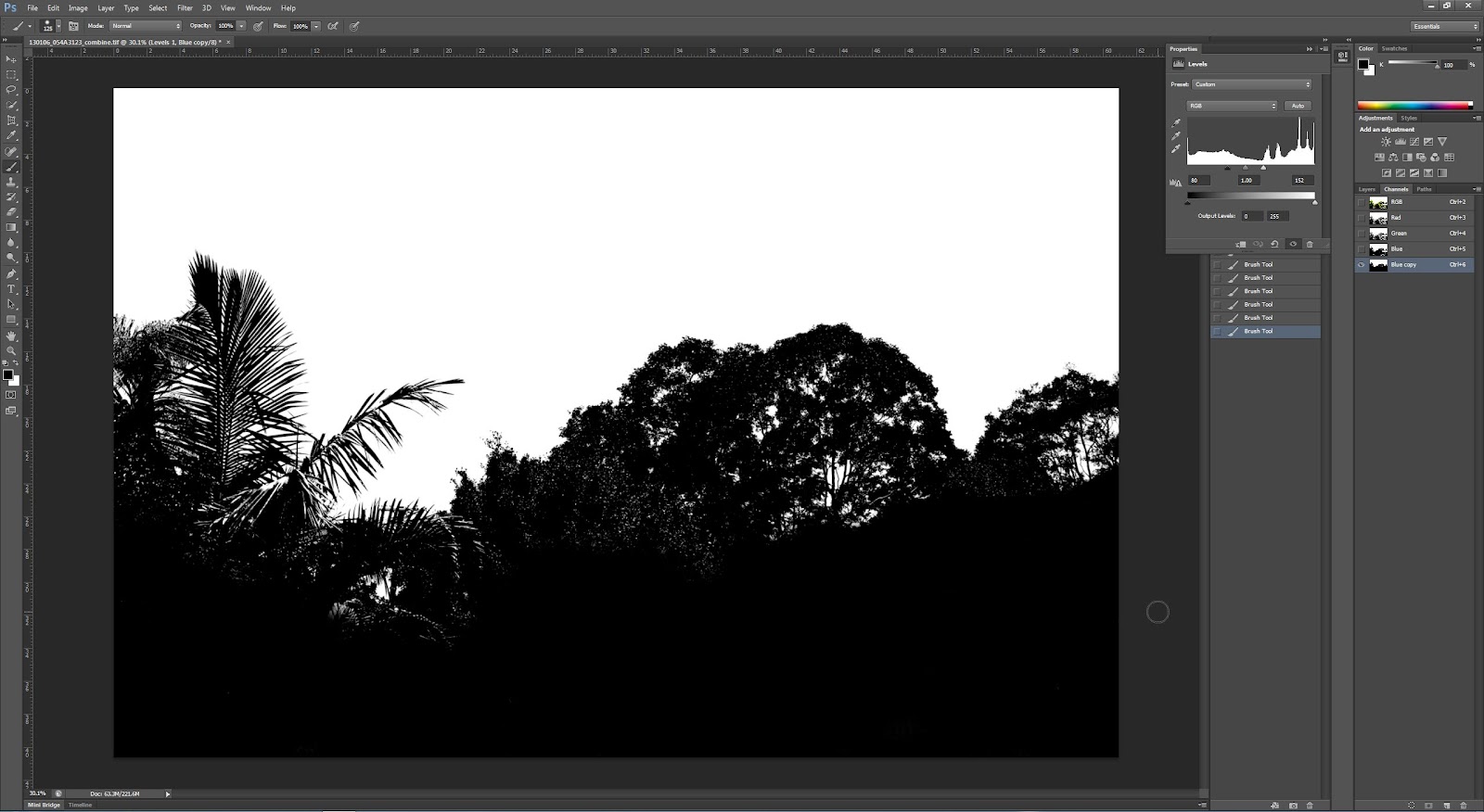
Then paint with black brush the areas in the foreground I want masked out.
Erased areas in bottom half of image that are not part of the mask using a black brush
Then with copied blue channel active click on the dotted circle at the bottom, and invert the selection. Then with the Layer 2 active (the sky layer) click the ‘add mask icon’ at the bottom of the layers panel. A much more detailed mask and quicker also.
Combined image using more detailed selection mask
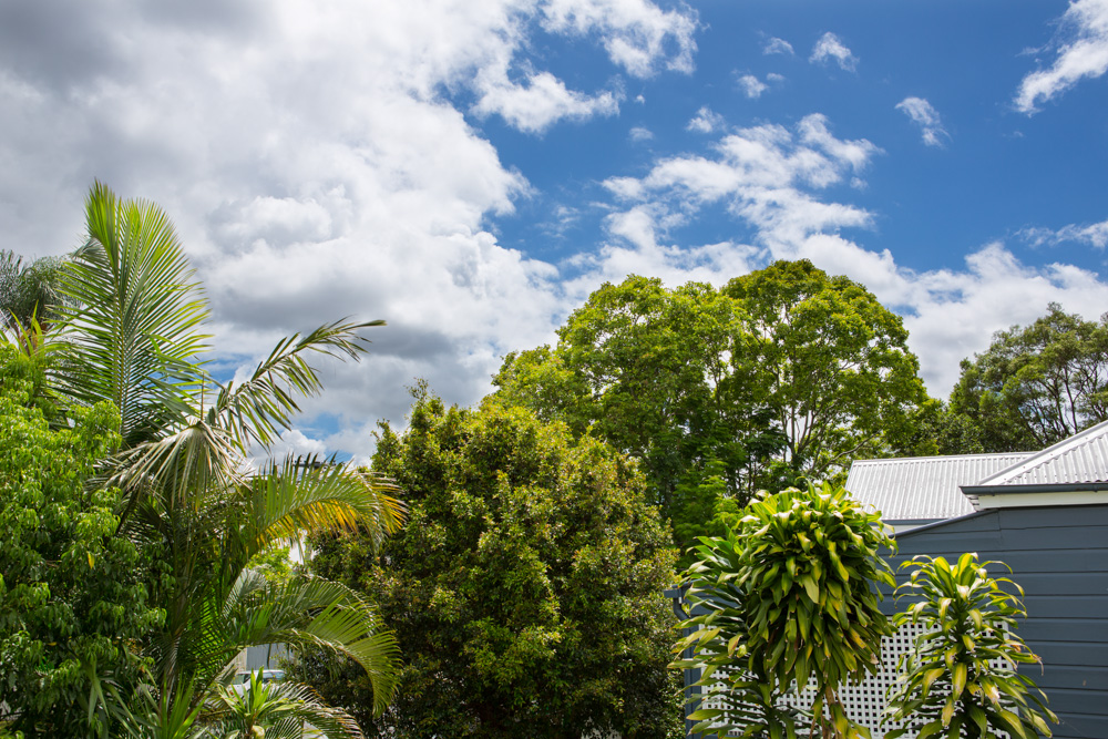
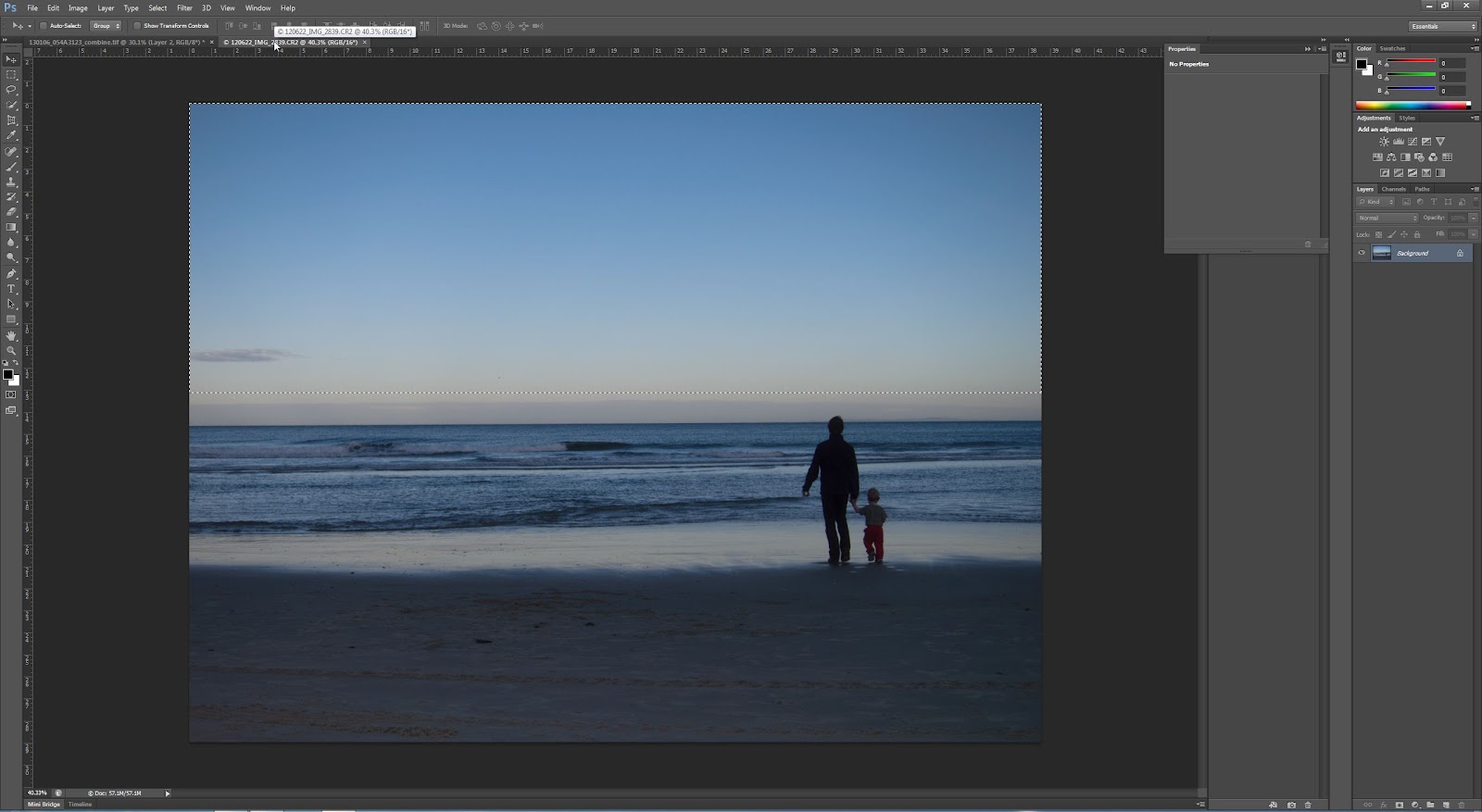
Next, choose another sky from another photo. Copy the sky, paste as new layer and place behind the layer 2 so that it shows up above the background layer. I just chose a simple blue sky, as it is the technique we are focussing on here. The colours roughly match those from my landscape image, and I just stretched the sky down to fill the whole area. When doing this technique it's important to look at any reflections (i.e., if replacing a blue sky with a dramatic cloudy image there may be blue reflections on some objects which need to be adjusted) and also consider the direction of light.
Image where i have taken the blue sky from
New sky added using same technique with channels to create mask
Conclusions:
I have learnt a few new Photoshop skills whilst doing this exercise. Selecting using the channels seems to be much more detailed and better for this exercise. I think I will definitely use this technique again for other images.

As for replacing a sky - I think the first example is quite reasonable - a kind of simplified HDR without all the fancy technique - fairly justifiable ethically. The second is a bit more dubious - replacing a large part of the picture with part of another picture, in this case from somewhere no where near the original is somewhat dubious. I think this is not really ethically sound for most kinds of photography apart from where it is clearly stated that there are large parts of the image that have been replaced. However, I know not all photographers will agree with this and they may think that it is fine. A spectrum of possibility...

References:

Better Photoshop Techniques Magazine, Issue 29 2012

Wednesday, 2 January 2013

Exercise: Alteration

This exercise is all about full-on alteration of an image.

Aim: The aim of this exercise is to totally adjust an image to remove a major element from the scene. Tools which can be used are mainly those in Photoshop - this is a job for the big guns! Although not specifically discussed in the notes, I guess we are meant to consider the ethics of this sort of change to an image.

Procedure: This goes beyond anything I have ever attempted in Photoshop before, and thus was a bit daunting. I have chosen one of my 'rejected' images for my houses project. This image was rejected because it has a car in front of the house and I found it too distracting. I did however really like the bright yellow fence out the front and the contrast with the red brick walls and blue sky. So I decided it was a good image to attempt this exercise.

Here is the starting image. I have chosen to remove both cars, or attempt to anyway!
Starting Image
I made some minor adjustments (black/white points, clarity, vibrance and contrast, in keeping with the other images in this set) in Lightroom before opening in Photoshop.

I decided to start with the easiest part, which I thought was the wall.
Starting with the wall
There are some bad repetitions in the wall, but I decided to just do gross changes first before tidying up later on. In the screenshot below, most of the wall is done and I have concentrated in the detail near the bush.
Editing near the wall and bush
Next I worked a bit more on the car, and also on the foreground where there is clear repetition of the grasses. I am mostly using the clone tool for this exercise.
Foreground

more work on the foreground
I then did some work on the wall and stair area which I was aware could be the hardest part of this exercise.
Started work on the stair area
The stairs did prove tricky but I feel like i managed to get a reasonable result. I then finished tidying up near the intersection of wall and plant and stairs.
Tidying up near the top of the wall
I needed to fix up the stairs which I had made a mistake with, (kept the bit under the stairs aligned vertically instead of following down stepping out to the left of the image). This was easily fixed.
Working on the stairs
 Here I have basically finished the stair area.
Almost there with the stair area
Next I removed the car on the right - the fence palings were quite easy. I then copied the LHS of the driveway, flipped it and placed it on the right, making a few changes and then adding in some more grass with the clone tool etc. I am quite pleased with how easy this change was.
Removing the moving car on the right, and making the RHS of the driveway and fence area
The rest of the car was removed and the repetition was fixed to some extent, though there is still some repetition in the image. I think with further practice this would be possible to remove but I have decided to draw a line under this exercise at this point.
Rest of the main car removed
The final step was to use the crop perspective tool to straighten the verticals of the image and call it finished.
The starting and finishing images are shown below:
Starting Image

The finished image, also straightened using the crop tool in Photoshope

Conclusion:
When I started on this exercise I was a bit overwhelmed with the task ahead. However I soon realised the power of the clone tool and what could be done with it. The final image is by no means perfect, there are too many repetitions, and if you really zoom in then there are clearly areas where the cloning work is not very good. However, this is not really my area of huge interest (photo manipulation), and whilst it is good to know how it's done, it's not really worth me spending too long on for this exercise. I think at first glance I have achieved the objective, though with closer scrutiny there are areas where I could improve (had I the time or inclination).

Ethically, this is obvious major photo manipulation and certainly would not be acceptable for documentary work, or even landscape/nature photography. I recall a World Press Image a few years ago which had a major element removed with great uproar around it. And a landscape image just last year which was removed from the competition (after winning it strangely) which had had 'too much Photoshop work applied'. Strange how it could get that far in the competition without that being picked up on though... Anyway, this is clear manipulation and needs to be presented that way.

Saturday, 29 December 2012

Exercise: Enhancement

Aim: This exercise follows a simple process of altering a specific part of the image to 'emphasise' it. The ethics of this are then considered.

Procedure:
The initial shot exported out of LR (cropped slightly) is of my younger son, shot with ambient light through a window coming onto his face. 
SOOC version
Using LR's masking utility, I have selected the whole face area for alteration
red mask showing area of selection
The whole face is lightened using exposure and contrast adjustements. The face is more prominent than in the SOOC version
Whole face - increase exposure and contrast
Next just the eyes were selected for enhancement - this time increasing brightness and saturation just over the eye area.
Eyes only adjustment
Then I kept the eyes adjusted and just increased the exposure for the whole image, which is a more balanced image than the previous one.
Eyes adjusted and whole image with increased exposure
Finally we are suggested to alter the colour of the iris by changing the hue. I did this by selecting just the iris area with a mask and using the colour temperature to make the eyes more blue.
Adjusted eyes to make them more blue

Conclusions:
Well I feel quite comfortable with the whole face selection and adjustment. This is just simple dodge and burn of a large area. Once the area is getting quite a bit smaller and the adjustments are as clear as adjusting the saturation and brightness of the eyes, we are getting into dubious territory. The changes are quite significant, and while that is OK, it's also not reality... (though then we get into a discussion about what is reality?, is any photograph really real?, and is there any subjective imagery?)

I think changing the hue selectively is quite a major change, and ethically needs to be pointed out to the viewer/purchaser/whoever. But I do know that these changes (and others such as adjusting waistlines etc) are common-place in the magazine industry (though debatable whether the general public has such good awareness, though with the rise of the internet more people do know about it). I certainly wouldn't feel comfortable changing the colour of eyes with regularity without making it obvious...

I feel like this is a can of worms! Which is certainly why it is part of this coursework...