This exercise is all about full-on alteration of an image.
Aim: The aim of this exercise is to totally adjust an image to remove a major element from the scene. Tools which can be used are mainly those in Photoshop - this is a job for the big guns! Although not specifically discussed in the notes, I guess we are meant to consider the ethics of this sort of change to an image.
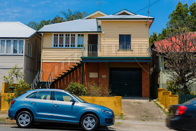
Procedure: This goes beyond anything I have ever attempted in Photoshop before, and thus was a bit daunting. I have chosen one of my 'rejected' images for my houses project. This image was rejected because it has a car in front of the house and I found it too distracting. I did however really like the bright yellow fence out the front and the contrast with the red brick walls and blue sky. So I decided it was a good image to attempt this exercise.
Here is the starting image. I have chosen to remove both cars, or attempt to anyway!
 |
| Starting Image |
I made some minor adjustments (black/white points, clarity, vibrance and contrast, in keeping with the other images in this set) in Lightroom before opening in Photoshop.
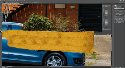
I decided to start with the easiest part, which I thought was the wall.
 |
| Starting with the wall |
There are some bad repetitions in the wall, but I decided to just do gross changes first before tidying up later on. In the screenshot below, most of the wall is done and I have concentrated in the detail near the bush.
 |
| Editing near the wall and bush |
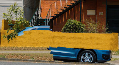
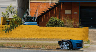
Next I worked a bit more on the car, and also on the foreground where there is clear repetition of the grasses. I am mostly using the clone tool for this exercise.
 |
| Foreground |
 |
| more work on the foreground |
I then did some work on the wall and stair area which I was aware could be the hardest part of this exercise.
 |
| Started work on the stair area |
The stairs did prove tricky but I feel like i managed to get a reasonable result. I then finished tidying up near the intersection of wall and plant and stairs.
 |
| Tidying up near the top of the wall |
I needed to fix up the stairs which I had made a mistake with, (kept the bit under the stairs aligned vertically instead of following down stepping out to the left of the image). This was easily fixed.
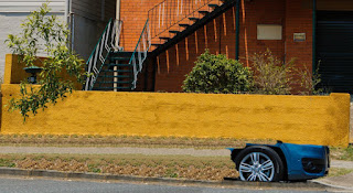 |
| Working on the stairs |
Here I have basically finished the stair area.
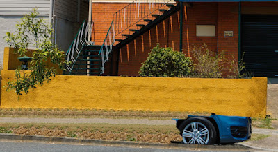 |
| Almost there with the stair area |
Next I removed the car on the right - the fence palings were quite easy. I then copied the LHS of the driveway, flipped it and placed it on the right, making a few changes and then adding in some more grass with the clone tool etc. I am quite pleased with how easy this change was.
 |
| Removing the moving car on the right, and making the RHS of the driveway and fence area |
The rest of the car was removed and the repetition was fixed to some extent, though there is still some repetition in the image. I think with further practice this would be possible to remove but I have decided to draw a line under this exercise at this point.
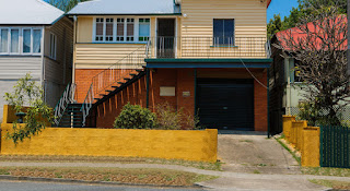 |
| Rest of the main car removed |
The final step was to use the crop perspective tool to straighten the verticals of the image and call it finished.
The starting and finishing images are shown below:
 |
| Starting Image |
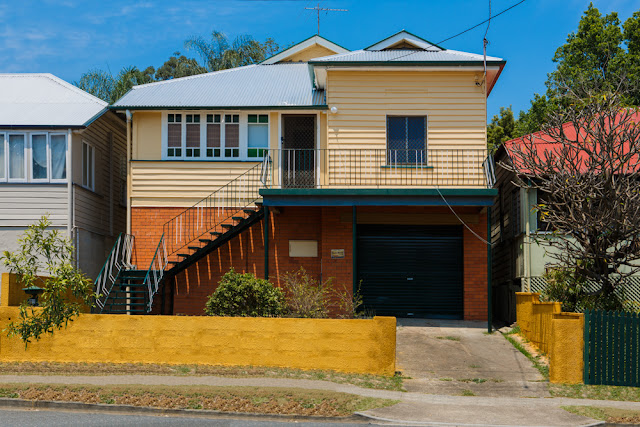 |
| The finished image, also straightened using the crop tool in Photoshope |
Conclusion:
When I started on this exercise I was a bit overwhelmed with the task ahead. However I soon realised the power of the clone tool and what could be done with it. The final image is by no means perfect, there are too many repetitions, and if you really zoom in then there are clearly areas where the cloning work is not very good. However, this is not really my area of huge interest (photo manipulation), and whilst it is good to know how it's done, it's not really worth me spending too long on for this exercise. I think at first glance I have achieved the objective, though with closer scrutiny there are areas where I could improve (had I the time or inclination).
Ethically, this is obvious major photo manipulation and certainly would not be acceptable for documentary work, or even landscape/nature photography. I recall a World Press Image a few years ago which had a major element removed with great uproar around it. And a landscape image just last year which was removed from the competition (after winning it strangely) which had had 'too much Photoshop work applied'. Strange how it could get that far in the competition without that being picked up on though... Anyway, this is clear manipulation and needs to be presented that way.


It's worrying really in terms of all the manipulation that can be done but you did a good job here.
ReplyDelete