I have learnt a lot during this particular Assignment, and I do feel like the hard study is starting to form some kind of coherent shape, and that it has culminated in what I feel is quite a successful project. The notes ask me to reflect on how well my project matches up to my original intentions, so I make some comments below:
How did I choose my theme? Was it a good choice?
Well I was interested in Typology and also in facade/hiding/what we present to the world via our homes (during the time I was in the process of putting out home on the market, so was very aware of presentation and also hiding any personal touches within our home as much as possible). I have always liked pattern/repetition in photographic images, and had seen some of the work of the New Typology movement and thought it looked interesting. As I walked the streets with baby in pram, I found myself drawn to capture certain houses, so started doing so more methodically and carefully, bracketing my images, and exposing to the right, carefully framing, using consistent apertures/shutter speeds as much as possible and being aware of which way the sun was facing and thus which streets would produce better photos depending on the time of the day! I think it was a good choice because it suited me at the time (proximity is important!), was a personal interest (and I think will be interesting to others) and seems to hold together well at the end point.
What went well? What went badly?
The set is quite cohesive. I took lots of photos which gave me good choice when I came to the selection stage. Some houses I took a couple of different photos on different days (some a month or more apart!) which gave me more choice in the final selection. I possibly should have avoided bin collection day, but I don't actually think they detract too much from the final images!
Did I stick to my original brief?
Actually, I did. I tossed it up in my mind quite a few times, but kept coming back to it, particularly the more images I took. I almost make the mistake of only processing my selected dozen images, but I'm very glad I didn't. I took all of my potential images and processed them all with care in Photoshop (the processing was fairly simple actually so it was not too time consuming). Then once I had them all printed as proofs, I lay them out and assessed each one in it's final form. The chosen 9 images contain some of the initial dozen but there are a number of omissions, I have even left out some of my 'favourite' images because I didn't feel that the fitted in the 'Hide' set. They may form part of a greater typological study though, should I decide to continue with the project. This has taught me a good lesson about not being too restrictive in my mind too early on - be willing to change direction mid-project as it may make the final result a better one.
What technical problems did I experience? How did I solve them?
Processing was a bit of a challenge. I needed to do it a few times before I worked out the best way to do it. I needed to be consistent across all the images, so I first did the RAW processing in Lightroom, and was planning on being able to edit the colour levels etc in Photoshop, but it turned out to be simpler to keep it all in Lightroom, and use PS for spot removal and straightening up the horizontals and verticals. I also made the mistake of cropping too early on initially so I have learnt to leave that right until the end! I also got my proofs printed and then realised I needed to loosen up the crop, but that was not a major problem, and the final prints look good (and I learnt to do a white border in Lightroom too).
Am I pleased with my final collection? What could I have done differently?
Yes! It is the first time I have really done a very cohesive set of images which really hang together very nicely. I would be proud to hang them on a wall (if I could work out how to hang them all neatly together!) The only thing I would do is take more images to enlarge the set!
And the title?
I have named my collection 'Hide' to indicate the way in which we hide behind the facade of our homes. In a literal sense, each image shows a house that has some barrier between it and the street - be it because it is set back, has a hedge or tree in front of has tinted windows. These may all have other purposes (shade/sonic insulation etc), but they also have the effect of separating the home from the street, thus the use of the 'Hide' title. I have also fairly carefully arranged the 9 images in an order which I felt made sense, grouping the images in 3 sets of 3 rows of similar type-houses.
The images are meant to be displayed in a grid, as I show in the first image below. Then I include the nine images for the assignment.
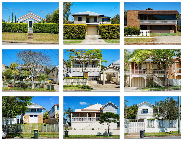 |
| 9 images displayed in grid |
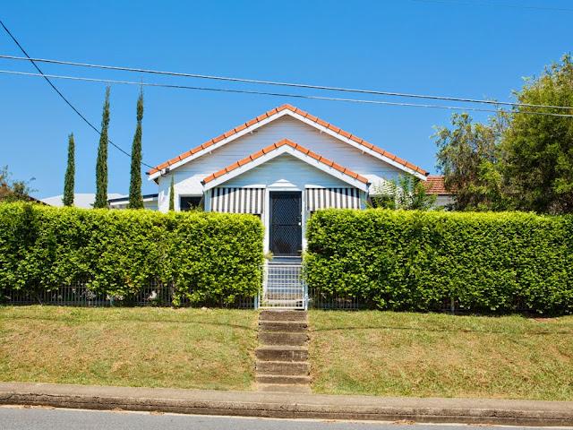 |
| Hide 1 |
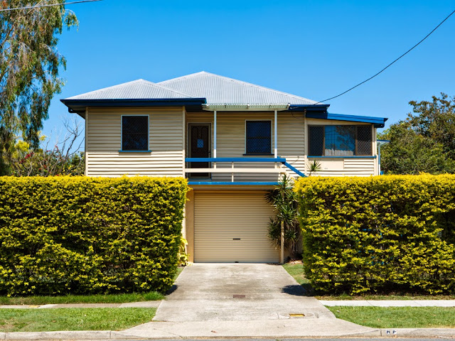 |
| Hide 2 |
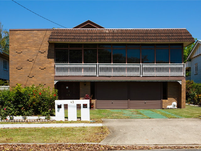 |
| Hide 3 |
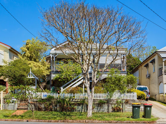 |
| Hide 4 |
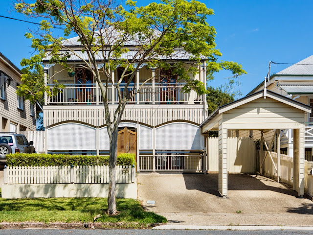 |
| Hide 5 |
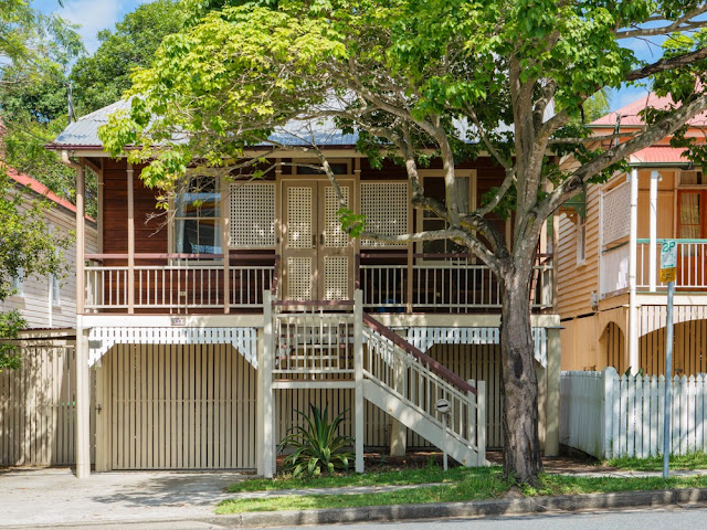 |
| Hide 6 |
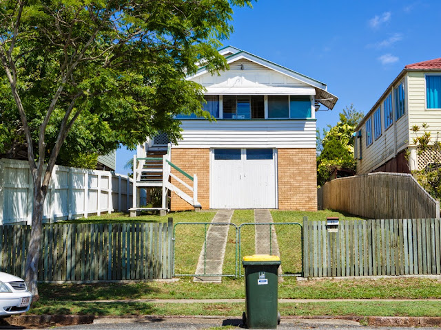 |
| Hide 7 |
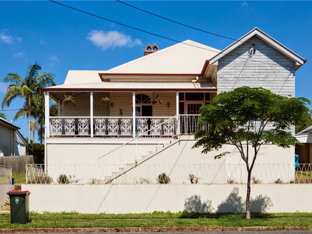 |
| Hide 8 |
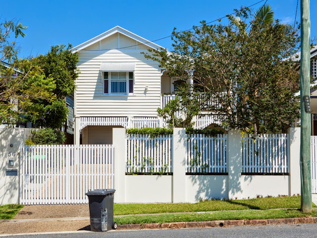 |
| Hide 9 |
References:
Wallace, S (2013), Digital Photographic Practice (Online), Available at: http://digitalphotographyselina.blogspot.com.au/search/label/Assignment%205 [Accessed 30/07/13]
I think your selection has come together really well Selena - and the grid display looks great. That would be a nice way to display them on a wall, I think. As you know, I have been doing this sort of work for some time. I do find that the technical side gets easier over time but it is a great challenge and I keep learning.
ReplyDeleteAgree with Eileen. These work really well. Interesting how the wheelie bins keep making an appearance.
ReplyDeleteAgree with Eileen. These work really well. Interesting how the wheelie bins keep making an appearance.
ReplyDeleteThe colours work so well together and add to the cohesiveness of the set. It might b a typology in intent but there are those subtle differences that makes me think about what's inside.
ReplyDelete