I am once again thinking about Assignment 5, which is my study of houses in Brisbane, Queensland, specifically in the Windsor area. I am interested in the typology of these houses, and have taken a few hundred photos of houses in the area on days of various weather, sun angle etc. I am now looking at choosing the final set to work on in Photoshop, and as part of this, am considering my rejects first. I had previously gone through and 'starred' my images, and considered which ones were good enough to consider for the assignment.
Since I am looking at typology, the set needs to be consistent, almost above every other aspect!! That said, the photos need to be interesting, there needs to be visual appeal, and the images need to be well presented and prepared appropriately. I am no longer able to take any more photos, as I don't live in the area any more and cannot travel there, but I feel like this is not at all a problem as I have a large set of images to work with, and previously considered capturing the images in a consistent manner.
I started with 46 images in my 'Houses' collection. A couple of these were 'doubles', that is, houses that I photographed on more than one occasion, for one reason or another. For example, if the weather was a bit overcast on one day, but I wanted to record the house anyway as I was there, I took the shot in the poorer weather and then returned on another day. I also sometimes was unlucky with cars being parked in front of the house, but took the shot anyway, then I could decide later if it was worth returning to or not. I also photographed one lovely sunny day that also happened to be bin collection day... not ideal. Below is an example of one of my doubles that I returned to later:
 |
| a house I returned to (left photo) to capture an image without bins, and also with better sky |
The second image (left) has the advantage of the bins not being present, and also the weather is better for my selection, which has almost all blue skies.
Another reason for images not being acceptable was the presence of parked cars. For some houses there was simply always a parked car out the front, so I could never get an image without a car there.
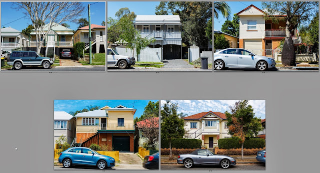 |
| houses with cars parked out the front |
As I discussed in this
blog post (Alteration), I could spend numerous hours removing cars from the image (not really my strong point!), but this is not the aim of my exercise nor my interest, so I am not going down that route!
Another group of houses had large trees that just seemed to take over the image too much. Looking at these as a grid they could almost be a set of their own! However they were not suitable for this project, despite me quite liking a couple of them, they didn't fit in with the others I selected. Some of these also had the 'bin' problem! I took a couple of these thinking that it might be interesting to have the house 'hiding' behind the tree, but visually it didn't really work all that well, though I do like a couple (middle top row and middle and right second row in particular).
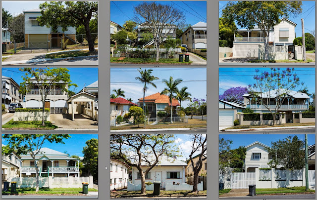 |
| houses with large trees present |
Finally there were the images that just didn't have the right 'feel', or lacked a certain oomph. There is nothing wrong with these images, the houses just weren't quite right for my taste, or once again didn't fit in with the set as a whole. A couple suffer from the 'bin' issue also. It is quite hard for me to define what it is I don't like about these images, they just are not as coherent as the final set.
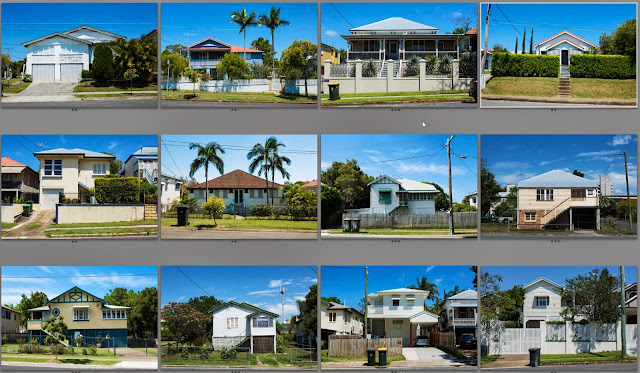 |
| rejects just because they didn't fit in |
So then I have the final set of 12 which I think I will now go forward with editing and preparing for presentation. They are shown below:
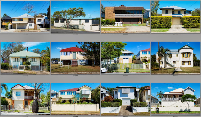 |
| Final 12 images |
They are not ordered as I plan to present them, but they still feel like quite a coherent set. There are a couple with bins which I will decide later on whether I keep or remove digitally. I also need to do some straightening of verticals and horizontals, and need to get the skies a more consistent colour perhaps? There will be individual tweaks to each image and I have done some cropping on the above images which I will review when doing the next stage of processing in Photoshop. I plan to open them in the raw convertor, apply constant adjustments for each image, then open them as smart objects in Photoshop, do further cropping/cloning/straightening as required, and still have the flexibility to go back to the raw editing later if it is necessary. I think this is the best way for me to edit them as a set, especially as I won't be able to do all the editing at once. I will also try to keep some notes and document some of the editing on this blog for my own learning.


This is an interesting collection. I prefer the set with trees (but then I guess I would, as that reflects my own interests).
ReplyDeleteYou don't explain why bins and cars are unacceptable, and what effect removing them from the picture (either through PS or reshooting) has on the images and how they are read.