Jeff wall photographs
When I was in Melbourne recently I visited the Jeff Wall exhibition at the
NGV. I took notes on my iPad (which was perfect for the job), and have included them below (with - dashes) , as well as some post-exhibition notes and included some of the images below. I took notes on most of the images and also watched part of a talk the Jeff Wall gave at the Tate a few years ago. I had read a bit about Wall's work prior to visiting the exhibition, so I had some ideas about what I would be seeing, but I admit that I was quite blown away when actually standing in front of the large lightboxes. I was amazed also, after viewing the whole exhibition, of the breadth of his work. It is consistently excellent, cinematic, engaging, interesting and covers such a huge range of genres and types. I have heard him described as one of the greatest photographers of the time, and I now feel I have a better understanding why this is. I think almost every single photograph made me stop and think. About something. Social, political, questioning, wonder about his purpose/drive/method. A very very interesting exhibition and one I would happily return to should I get the chance.
- They glow!
- Detail… Every single small item can be clearly resolved
- Awesome clarity
Not possible to put him in a box. Not documentary, but staged, cinematic, following on from pictorial traditions, but also influenced by literature, other photography, sometimes shooting still lifes, other times portraits, always story-telling through images. By watching, observing (e.g. on the street), he then recreates scenes in his own images ('Mimic', 'Milk', not seen in this exhibition unfortunately), is this documentary?? He is pushing boundaries, for example with his digital montage scenes ('Dead troops talk', and at this exhibition, 'a sudden gust of wind'), composing elaborate scenes which 'look' real on the surface, but once again raise the 'what is real?' questions?
Double Self Portrait 1979
 |
| taken from http://wednesdayaddamsblog.wordpress.com/ for personal study purposes |
- Tension.
- Clean and neat
- Contrasting poses. Angular.
Everything seems neat and composed and without anything left to chance. The two figures are both looking directly at the camera and their look is of an unflinching stare. The poses contrast each other - one 'closed' with arms crossed and body turned slightly away from the camera, the second more frontal and open, with hand on hip and resting on chair. Perhaps Wall is showing two opposing feelings he has towards the camera? The background is carefully arranged, with linear vertical stripes on the walls, an open door, a couch with blanket and a white armchair in the foreground. I think the tension between the two figures is quite marked, and balanced by the light shining on the middle of the background wall, where the eye tends to rest after flitting between the two men. The circular shaped chair in the foreground is also a viewpoint within the frame. The eye can be led out of the frame through the lines up the walls and along the ceiling, or via the open door. Neither man looks relaxed, or at ease, the tension is clearly experienced by the viewer, it is quite uncomfortable.
The Destroyed Room 1978
 |
| taken from http://www.sauer-thompson.com/junkforcode/archives/2012/02/jeff-wall-the-d.html for personal study purposes |
- Backlit, about 2m across
- Looks surprisingly 'clean' for a destroyed room… A little too neat perhaps? Items don't look truly damaged…could be the lighting and clarity? Reflective and sharp.
- Ladies room, with her shoes and scarves scattered across the room.drooping ceiling, gouges in wall. - Discarded combs jewels on the floor. Broken table, bed, mattress ripped, drawers out.
- Why? What message?
This image was a real beginning point for Wall, photographed after a hiatus in his painting career I believe, and marks a start of his 'building' of sets to photograph. It depicts a woman's room which seemingly has been 'destroyed', but unknown means, in a fairly violent manner. I was surprised with how 'clean' it was in some sense, perhaps the items were not truly 'worn' or 'used'. The artwork is large and vibrant, due to the backlit nature. The mess and randomness are not truly random, but instead arranged with some angular regularity I feel, the lower part is triangular, and the angles of the bed and table and with the criss-crossing of the boarded up door and window continue the angular theme. The vertical pulled off wall cladding to show the insulation behind contrasts nicely with the other angles. The colour theme is muted, though bold at the same time. In my notes above I have questioned why this image was created, but perhaps it was simply an outpouring of frustration related to Walls' previous work, and a breaking of tradition and trying something new, so the broken nature of the room reflects this? It is hard to remember some times that each image produced by an artist is produced at a specific period of time in their lives, and who knows what influences them at that time, emotionally and socially and even financially, which may drive their direction in an individual image. I guess that is why it is important to (if possible) consider the surrounding story to learn and understand more about the artist and their individual situation.
A woman and her doctor 1981
 |
| taken from http://www.mca.com.au/exhibition/jeff-wall-photographs/ for personal study purposes |
- What is this relationship? Not in a doctors room!.. Couch, wine goblets, cigarette, waiter,
Another mysterious photograph set up by Wall. The two 'characters' (and they really do appear to be fulfilling a role in this image) are not looking at each other with their eyes, but their 'conversation' is clearly underway! Their role could be assumed to be sexual, though the title complicates things by suggesting the relationship is professional! It does make me wonder how Wall sets up images such as these, and how much he directs, and how much he simply guides and then sits back to watch and photograph!!
Polishing 1998
 |
| taken from http://artblart.com/2013/03/05/review-jeff-wall-at-the-national-gallery-of-victoria-melbourne/ for personal study purposes |
- Bachelor. Velvet chair almost glows. Detail in carpet!
- Slightly melancholic feel, despite the glow
I found the textures really shone in this image - the velvet chair, the scuffed carpet, the matte and gloss contrasting paint on the walls.The image itself is slightly sad feeling; a single man (bachelor style) alone preparing for work in the morning, with fairly tacky furnishings and empty coffee cups etc. It is bland and melancholic in it's feeling. Once again I imagine him watching the scene and waiting for the 'moment' to capture the image (I imagine Wall as a few-image kind of guy, not shooting off rolls of film, perhaps this is the scale of the print so I assume large format camera??), so he would have to wait for the image to appear to him and then grab it.
Doorpusher 1984
 |
| taken from http://arttattler.com/archivewall.html for personal study purposes |
- High angle, but detail top to bottom
- Posed
This image seems a bit contrived to me. The man seems to be totally posed and for me this loses the impact most of Wall's other images have.
Pipe opening 2002
 |
| taken from http://www.americansuburbx.com/2011/04/interview-jeff-wall-talks-to-bob-nickas.html for personal study purposes |
- Small (the print is small, perhaps a foot square)
- The little things
- Angles, lines, shapes, texture, darkness in hole, lightness of wall,
Diagonal composition 1993
 |
| taken from http://www.tate.org.uk/art/artworks/wall-diagonal-composition-t07961 for personal study purposes |
- Small (the print is small, perhaps a foot square)
- Sink with cake of soap, dirty, paint flecks, woven curtain, shadow,
- Texture,
A dirty sink. A photograph I'd happily have on my wall (though I suspect my mother wouldnt' approve!) This is an amazing image, so simple, but yet so beautiful. The lines all converge on one point, next to the soap bar and piece of (?) rubbish. The colours are soft and pastel and speckled. It really shows a careful observer and even more careful composer of a good photograph! The shadows within the sink and also on the right hand wall emphasise the shape and form of this image. I note from the
Tate site where I got this image that it was taken in his basement, and is actually life sized. This reminds me of the talk he gave (shown at the exhibition), that his images were all printed at the 'right' size, not necessarily really large, but simply the size that he thought was correct for that image. In this case, it's life sized, which makes sense really!
Just washed 1997
 |
| taken from http://www.mutualart.com/Artwork/Just-Washed--1997/0D5037863DBD2791 for personal study purposes |
- Small (the print is small, perhaps a foot square)
- Dirty looking cloth coming out of washing machine
- Mundane, yet interesting composition
- Arm coming in from out of the frame but not seen for long (covered by cloth)
- Angles of tub and spartan color palette for interest
Adrian walker 1992
 |
| taken from http://robertjackson.info/index/2010/12/no-3-after-invisible-man-1999-2001/ for personal study purposes |
- The detail IS impressive! Can see book name! And condensation inside buckets.
- Posed but realistic
I read about this image in Michael Fried's book before I saw it at the exhibition, so I was prepared for it. It is an interesting image of quiet contemplation of a worker at his craft (a scientific artist).
A view from an apartment 2004
 |
| taken from http://www.tate.org.uk/art/artworks/wall-a-view-from-an-apartment-t12219 for personal study purposes |
- Less clarity than other works, but freezing a moment (woman walking), so to be expected (can see grain)
- huge image (2.5m wide?)
- Why is it different to simply going to someone's house to photograph them? He is invisible.
- Nice view of harbour.
- Did he direct her?
- Other woman seems oblivious totally! Slouching on couch with magazine!
- Interesting capture of how people live their lives in private… Hard to see how this could be really done… Crewdson did this too?
A staged yet private scent. We know Wall rents this apartment and asks the young people to live in it and then comes and photographs them as they go about their daily lives. Could be considered a bit creepy actually!! But anyway, the view to the harbour is lovely, and the self absorbed looks on the womens' faces is quiet and pleasant. It's a 'nice' shot, but also is an interesting peep into other people's lives, supposedly without bias (is there such a thing??), so perhaps the real commentary is sociaocial? Why did he choose this particular moment, and what about this image makes it so successful and interesting? Perhaps it is its mundaneness that is simply so lovely... It is cinematographic, a scene in which we wonder what will happen next.
Reading on the
Tate website where I got this picture above, it is a digital montage again, (which makes sense, the dynamic range of the outside and inside would be almost impossible without flash).
Dressing poultry 2007
 |
| taken from http://au.phaidon.com/agenda/photography/picture-galleries/2010/march/30/the-world-of-jeff-wall/ for personal study purposes |
- A moment! In an amazing space! Feel like you're there!
- So much detail but doesn't feel cluttered.
- Woman laughing is totally the peak, aim, point of image
- But the rest is fascinating! A truly wonderful picture.
After invisible man by Ralph Ellison, 'the Prologue,' 2000
 |
| taken from http://arttattler.com/archivewall.html for personal study purposes |
- Lights shine out!
- Detail!!!
- Could sit for hours…. there is just so much in this image!
Staining bench 2003
 |
| taken from http://www.mariangoodman.com/exhibitions/2004-04-16_jeff-wall/ for personal study purposes |
- Slightly unbalanced feel to composition (too bottom heavy/not enough space at the top of the scene for my liking!) eyes flick around (high contrast in colors and busy too ) blocks of black feel heavy compared to white tin lid
- Really glows in the light box
Untangling 1994
 |
| taken from http://www.artguide.com.au/features/features/the-photography-of-jeff-wall/ for personal study purposes |
- Lots of rope there!!
- Wonderful light
- Great colour
A sapling held by a post 2000
Clipped branches 1999
A sudden gust of wind 1993
 |
| taken from http://arttattler.com/archivewall.html for personal study purposes |
- Large
- Detail!
- Away goes that hat!
- Scarf covering woman with papers face!
- Workers in the fields with their red hats on
- refers directly to a woodblock print by Japanese artist Katsushika Hokusai
- required over 100 photographs, taken over the course of more than a
year, to achieve a seamless montage that gives the illusion of capturing
a real moment in time.
This is an amazing piece of work. I can't imaging taking 100 photos to construct one scene! His patience must simply be incredible, and the way he can imagine what it will look like without actually seeing the scene (I guess this is his painting training?). And there is so much more detail than can be seen in the small scale. It really needs to be viewed in the original to see the lovely detail.
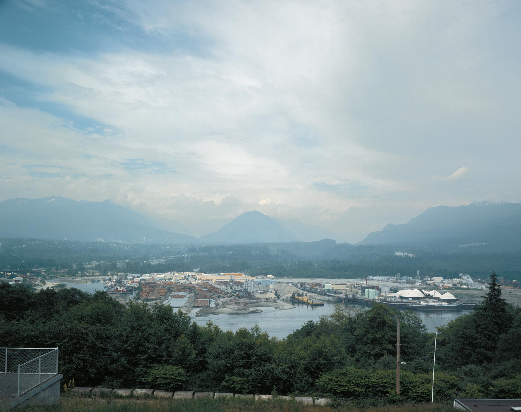
Coastal motifs 1989
 |
| taken from https://www.moma.org/interactives/exhibitions/2007/jeffwall/ for personal study purposes |
- Land/city scape
- Foreground adds interest and context
- Detail in mid ground trees, docks, raw materials,
- Mountains in distance
- Sky fills upper half of image
Inclusion of many man-made elements to this 'landscape' - questioning perhaps the validity of conventional/historical landscapes perhaps?
Florists shop window 2008
Clashing colors!
Reflection
Discordant
Knife throw 2008
 |
| taken from http://www.mariangoodman.com/exhibitions/2009-09-22_jeff-wall/ for personal study purposes |
- Dark
- What is other man holding? Figures in background on floor…
- Run down, strong side lighting … Sinister
Colour palette is warm and soft, which clashes with the subject matter. Peeling paint on the walls strongly lit from the side which makes it very 3-dimensional.
Night 2001
 |
| taken from http://oaj.oxfordjournals.org/content/30/1/69/F1.expansion for personal study purposes |
- B&W
- Dark (actual is darker than the image displayed here on blog).
- Hard to pick out details
- Homeless people?
- Reflection in water
- Creepy feel
Ivan sawyers 2009
 |
| taken from http://whitecube.com/channel/in_the_gallery_past/jeff_wall_on_ivan_sayers/ for personal study purposes |
- Other worldly!
- Historical yet contemporary contrast. Power point on wall behind, reflection of people in background.
Boy falls from tree 2010
 |
| taken from http://arttattler.com/archivewall.html for personal study purposes |
- Cinematic scene
Jeannette in wirtz' garden 2009
- Simple yet pleasing image
Volunteer 1996
 |
| taken from http://www.ngv.vic.gov.au/whats-on/exhibitions/exhibitions/jeff-wall-photographs for personal study purposes |
- B&W
- Lovely tones
- Captured a moment… Bored yet doing his job
The image looks simple, but is deceptive. I'm pretty sure that it didn't just take 5 minutes to shoot this! It would have been very carefully considered, viewpoints and framing chosen and then the man asked to mop! Everything is carefully balanced and ordered in the frame, there are strong vertical components, which offset nicely the bold diagonal of the mop handle and white v of the t-shirt stands out against the rest of the textured greys.
After spring snow 2000
 |
| taken from http://www.nytimes.com/slideshow/2007/02/24/arts/design/20070224_WALL_SLIDESHOW_4.html?_r=0 for personal study purposes |
- Woman in finery getting something out of shoe… Train?
After a book, 'Spring Snow', by Yukio Mishima. Mysterious, delicate, interesting, portrait of a lady, cinematic, we want to know more!
General thoughts:
No consistent size or shape of images.
All strong/vivid colour (even if almost monochrome)
Atypical
Video. Jeff Wall, Artists talk Tate 2005
- Way contemporary art interacted with art of the past… Was it really of the past given he was looking at it now (60s).
- What painting and cinema meant to western culture?
- Felt excluded from photography in the 1970s
- Walker Evans… Perfection… Felt he couldn't compete
- Didn't do anything for 5 years
- Photography for him that was different from other photography
- Cinematography… Preparation and collaboration… So adapt some techniques to make photos not part of the film… More like being a painter… Pictorial.
- Printed on transparency… Because he liked the vividness of colour etc. every medium has its specific qualities.
- Destroyed room… Culmination of his personal issues. Loss and recovery of his studio.
- Wanted to then move outside from the studio.
- Didn't want to create a polarity between his studio and outside photography.
- Factual vs fictional photography
- Street pictures (mimic)… Another genre… How to deal with actual events, out of the studio - Didn't photograph the event he saw, and that changed how he felt about it. Opened a door for him as an artist. Renounce things as an original gesture. So he reconstructed the event, make the viewer feel that the event was like an event in the real world. A claim to truth, though it is only a contemplation of documentary… Near documentary photography. Report on happenings or occurrences.
- Wanted photos to be about life size… Very intimate.
- Photos not big, simply the right size.
- Storyteller
- Panoramic view pulling back means it is different to a street picture.
- Not all planned in advance. Didn't direct figure to get into that position. He allowed it to stand, but didn't happen in a directed way none of his pictures look he thought they would.
- Pictures without events
- Nothing happening. What do we see when we are not really looking. Seeing.
- Scale determined by the visibility of that one face (bw night)
- Digital montage from 3 pieces of film. Cinamalistic. They are ignoring him, paying no attention. Not documentary though… (
- View from an apartment
- Previous interiors were quite closed in. No theme. This one opens right out. Panoramic view with secluded personal view
- Not have anything to do with way apartment was decorated etc
- Idea of the everyday… Unremarkability of the everyday. No drama, no event.
“My work is a reconstruction and reconstruction is a
philosophical activity. If I can create a drama that has philosophical
meaning, that’s fine, or sometimes, it is not from meaning but a
reconstruction of a feeling. It is best to capture in a photograph a
feeling, an emotion, a look, a memory, a perception or a relationship.”
.
Jeff Wall (artblat.com, 2013)
References:
http://www.ngv.vic.gov.au/whats-on/exhibitions/exhibitions/jeff-wall-photographs
http://artblart.com/2013/03/05/review-jeff-wall-at-the-national-gallery-of-victoria-melbourne/
http://www.tate.org.uk/art/artworks/wall-a-view-from-an-apartment-t12219


