I've been thinking about the next assignment for this module. My tutor said in a recent email that "soon you will have to start thinking carefully about what you photograph" (paraphrase). This has been playing on my mind a lot recently. We are also in the process of selling our home. Each week we spend a few hours tidying and depersonalizing our home to make it more appealing to potential buyers. This process has got me thinking about how we 'hide' behind the walls of our houses, and by opening our house up for strangers to walk through every week is a bit like opening up part of ourselves. I also wonder what people would make of us by what we have in our homes, and even simply by what our home presents like. At times of great change we often question ourselves,and I am also questioning what I am... We use many words to describe ourselves, but when out socially and someone asks me what I do I say I am a geophysicist. Why do I give my professional title? Why don't I say I'm a mum, or a photographer, or a loving wife? We all have different labels for ourselves,and each label has a different perceived 'value' in society. Likewise, the car we drive (or don't), house we live in (or don't) all dictate how we are viewed by others. That is, we try to live up to expectations and ideals inhow we present ourselves to other, but does it really matter one iota? Is it because I'm not proud to be a mum or any of the other titles? No, because I think that it's the elements of my life outside by paid work that make me me, but I think that that is not what society thinks or expects. So we hide behind labels, like we hide our lives behind the walls of our houses. No one really knows what goes on behind closed doors in other peoples lives (fortunately I often think!), though this is being increasingly publicized as people live out their every minute online (something I'm guilty of too).
These above issues fascinate me so I've been thinking about how to formulate them into an effective photographic project. I came back to my 'house facade' project which I started recently. I thought that I don't know anything about the people in the houses, but that they probably share at least some of my personal values, attributes and descriptors that I would use about myself. So I'm going to title each image with a descriptor that I would use on myself, depending on how I feel about each house.
Thursday, 15 November 2012

Friday, 9 November 2012
Exercise: Interpretative processing
In this exercise we are encouraged to ‘get creative’ with processing.
Aim:
To choose an image open for creative interpretation. Apply
different processing techniques (experiment with lots of different options).
Then make three different versions of the same image, a written description of
what I was trying to achieve, and how well I think I succeeded.
Procedure:
I went to Mt Cootha Botanic Gardens last week and thought
carefully about composing some shots of the various cacti and succulent plants
which I thought would make good subjects for this exercise, and future
desaturation exercises where texture and form are important. I have been doing
some reading about ‘exposing to the right’, so for all shots I bracketed one
stop either side, using aperture priority.
Back at home, after uploading my images, I carefully looked
at the clipping on the brightest shots, and kept those that were not clipped,
and deleted the ones with lower exposure. I don’t want to get in the habit of
keeping three versions of an image with only the exposure different. My Hard
Drives already fill up too quickly, particularly with this new camera!
I then selected those images that I thought had lower
dynamic range and were thus suitable for this exercise. I was quite pleased
with my selection These images are shown below:
 |
| Selection of images appropriate for this exercise |
I went on to choose my image to work with for this exercise,
shown below without any post-processing:
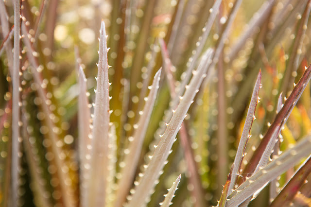

I first ‘optimized’ this image, shown below:


In Lightroom I made a virtual copy of this image and started
processing. I did lots of experimentation, tried tweaking all the sliders and
using black and white and just generally getting a feel for what could be done
in Lightroom, as I’ve mostly only used presets before. I did use the presets a
bit, but also tried to understand what was being done in the presets so that I
can use them in the future with more knowledge. Below is a selection of the
different processing techniques and results.
 |
| Selection of processing techniques in Lightroom |
I then chose my favourite four images (below):


before selecting the final three which I will discuss here
(below):


First image:

 |
| Soft Black and White |

In this image I was trying to achieve a soft looking black
and white image, which was quite high-key and old-fashioned looking. To do this
I first did a simple conversion to black and white, and then adjusted my
exposure, black clipping point and highlight tones to make the image bright and
light feeling. Then I went to the vignette slider (under ‘effects’) and added
in a white soft vignette to the image. I also added in some grain to make it
look lit it might have been shot on film. Finally I adjusted the shadows,
clarity and contrast slightly.
I really like this image. It is soft and floaty, which
contrasts nicely with the spiky points of the cactus. The vignette on the
corners adds to the washed out feel and I think it suits the addition of slight
grain. I have kept some of the blacks quite deep to retain some contrast in
this image. Overall I feel it is a successful and quite different rendition of
the original image.
Second image:


 |
| Contrasty Black and White |

I was looking for quite a harsh, contrasty black and white
image to provide a stark comparison to the previous soft image. So I chose the
opposite route basically. I applied a heavy contrasty blue filter to the black
and white starting image. This darkened down the image considerably, but I kept
the highlights high and bright to really emphasise the tips of the plant and
small spikes. There is a dark vignette applied to this image to bring back emphasis
to the plant and heighten the drama.
I like the strength and surprise in this image. The plant looks so very spiky and dramatic.
I like the strength and surprise in this image. The plant looks so very spiky and dramatic.
Third image:
 |
| Cross-processed image |
 |
| settings for producing 'cross-processed' image |
A bright, light, colourful ‘cross-processed’ image. I tried
a few versions of bright, contasty, highly colourful images and decided I liked
this one the best. I have not done ‘cross-processing’ at all before, but quite
like the effect it has on this image. I also played a bit with the saturation
and luminance of some colours to boost the effect. I like the high contrast,
slightly otherworldly colours that have been brought out in this image.
Conclusion:
The notes ask me to consider ‘how well I have succeeded’.
Well I had some feelings about light/dark/bright colour but not more than that
really before I started. I chose my starting image quite carefully (shot with
this project and other similar ones in mind), so I guess I’ve been successful
in the sense that I have imaginatively edited this image into three more
interesting, different images. This in some ways for me has opened up a whole
new creative side to my photography, as I have not spent much time at all
before ‘editing’ images in this way (mostly choosing to stick more closely to ‘reality’,
whatever that means!). This exercise shows me that a little tweaking here and
there can radically alter images (sometimes for the better, sometimes not so),
and that there is great variety and scale of change that can take place in one single
image.
Assignment 2 Feedback
I have received my feedback for Assignment 2 from my tutor.
The comments on the assignment suggest that my technical skills are perfectly
acceptable for this level of the course. The suggestions were to continue to
learn more about the technical side of things but to concentrate more on the
creative side. This is something I have been grappling with myself lately as I
do more reading about the wider photographic community and various aspects of
‘art’ photography. How I view myself and my photography and the direction I
wish to take my photography have all been quite central to my mind recently.
My tutor suggested reading a fellow student’s blog, which I
have done, and found quite enlightening. He is a little further ahead than me
on the course, but is following a similar path, having previously completed at
least one course with the OCA, and seems to be quite similar in his direction
of looking for more ‘art’ than just ‘function’. He has taken an approach for 2nd
and 3rd assignments of choosing a ‘theme’ and following it through
for the assignment. My tutor has some useful suggestions on using a
self-directed project which I will closely consider for my future assignments.
It’s funny this transition from thinking of myself as a
‘photographer’ to an ‘artist’. It’s a subtle shift in some ways (semantics some
would say), but for me personally it is quite important and significant. I love
taking photos but want to do and achieve more than simply taking a ‘nice shot’…
And a cohesive, interesting project is just waiting for me, I just need to be
shoved in the right direction, take the plunge and do it. I have lots of ideas
but it’s hard thinking of how to execute ideas and make them into successful
_interesting_ photographic projects that don’t just look good but have some
kind of meaning as well…
References:
Saturday, 27 October 2012
Down the rabbit hole of conceptual art…
I guess the title is quite explanatory really… In conceptual
art, the idea is more important than the resultant piece of artwork ‘The idea
becomes a machine that makes the art’ (Sol LeWitt). Wikipedia notes that it is
important not to confuse intent with concept in defining a work of art. Duchamp
is considered to have paved the way for conceptualists, with his exhibiting of
‘readymade’ artworks, most famously ‘Fountain’ in 1917. It only appeared as a
real art movement in the 1960s (Wikipedia) and fits in well with the 60’s
attitude of breaking away from the mainstream in life and art. Interestingly,
Wikipedia says that ‘Conceptual art also reacted against the commodification of
art’, which goes against the modern phenomenon of artists such as Damien Hirst
who are playing right into the hands of the art market currently. In line with
this thinking, conceptual art was often recorded through documentation – for example
by photographing it. This is perhaps the start of conceptual photography,
though not in the same sense as it is thought of today. I find it interesting
to note that for conceptual art to be successful, it didn’t matter if it was
not executed properly – that is, the ‘artist’ didn’t need to have any specific ‘artistic’
skills! I admit to having walked around many modern art exhibitions and
commented with my husband that ‘I could have done that!’ – I knew enough at
that time to also comment ‘but they had the idea to do it’, which was my basic
understanding of conceptual art at that time!
Wikipedia has a great section on ‘Notable examples of
conceptual art’ which is quite an amusing read and shows the large variety of
ideas and concepts that have been executed as art in the last few decades.
There were also some links at the bottom of the page – I have included a couple
below that I found interesting, particularly Sol Lewitt’s “Paragraphs onConceptual Art” and the Stanford Encyclopaedia entry. So after doing some
reading, I feel like I’ve got a somewhat better grasp of what conceptual art
is, however, how this relates to photography I’m less sure. Many of the
examples of photographs mentioned in the articles are _of_ the art, not the art
themselves. So I chanced upon Source magazine online, which happened to have
three short videos entitled ‘What is Conceptual Photography?’. Perfect. Notes
below:
Part 1:
 |
| John Hilliard, taken from http://www.tumblr.com/tagged/john-hilliard for personal study purposes |
 |
| John Hilliard, taken from http://www.artfacts.net/en/artist/john-hilliard-1453/artwork/large-study-for-scare-cat-14936.html for personal study purposes |
- Not a commonly used term in art (conceptual) – not commonly
applied to oneself.
- Most photographs have a subject matter.
- John Hilliard – video of him and fellow videographer
spinning and filming each other and the background and shown together.
- ‘Idea art’ another early name for conceptual art.
- Less ‘critical’ industry around art in the 1960s – not like
there is now. The artists had to do the thinking and writing for themselves –
nobody else was doing it.
- The ‘documents’ were the important part – e.g. the
photographs.
- John Hilliard – interested in the technical apparatus. Exposure, speed – how to incorporate means of production into image itself. The subject is the object. E.g, 60 seconds of light. Reducing the question of ‘what exposure do I use’ to different prints.
- Hilliard – drafts up his ideas first (very prescriptive) –
he draws it first, and thus is very conceptualised
- ‘Camera recording its own condition’ – the same image 70
times
- Point of view – e.g. the cat with dog/woman – two images
overlain and flipped (i.e. looking at the cat from two sides) – i.e., why make
this picture from this place or that place?
Part 2:
 |
| Suzanne Moody, taken from http://www.trajectorartfair.org/archive2010/gallery/Michelle_Deignan.htm for personal study purposes |
- Suzanne Moody ‘Make love to the camera’
- ‘Dialogue around photography obsessed with representation
rather than the mechanism’
- Sean O’Hagen (Guardian)
- Lucy Soutter – content can be recognised, but the ideas and
historical references are not always recognised by the viewer
- Conceptual photography term can be a bit derogatory to other
forms of photography – suggests that there is no thought involved in ‘other’
kinds of photography
- Paul Graham ‘the unreasonable apple’
- What was the driving force of art before concept? Response of
the eye, poetic, tactile, emotional – these things are ‘out’ now!
- The idea may be obvious, but it may be held back
- One way of looking (photography) – given one point of view,
and sometimes it’s deceptive. (Suzanne Moody) – ambiguity is interesting. You
can never work it out.
Part 3:
 |
| Broomberg and Chanarin, Taken from http://universes-in-universe.org/eng/nafas/articles/2011/seeing_is_believing/img/broomberg_chanarin for personal study purposes |
- ‘All photography is conceptual, and all photography is not
conceptual – all photography is an abstraction of reality’ Oliver Chanarin
- Artist v Photographer
- A separate genre – closer to the art world than most other
photography is
- All contemporary photography is conceptual to some degree
(Lucy Souter)
- Difficult, obscure and meaningless work – and something
happens and meaning is found
- What do you expect to see? What do you want to see? … a
document in its true sense (Chanarin and Adam Broomberg)
- ‘photojournalism is being controlled, censored’ (Broomberg)
The videos gave lots of thought to the various aspects of
conceptual art and conceptual photography, and I shall continue to look more
into this as an interesting genre.
References:
Broomberg, A & Chanarin O (2011) Universes-in-universe Website [online], Available from: http://universes-in-universe.org/eng/nafas/articles/2011/seeing_is_believing/img/broomberg_chanarin [accessed 14 July 2013]
Hilliard, J (2012), Tumbler Feed John Hilliard [online],
Available from: http://www.tumblr.com/tagged/john-hilliard
[accessed 14 July 2013]
Hilliard, J (2008), Artfacts [online], Available from:
http://www.artfacts.net/en/artist/john-hilliard-1453/artwork/large-study-for-scare-cat-14936.html
[accessed 14 July 2013]
Moody, S (2004), Suzanne Moody [online], Available from http://www.trajectorartfair.org/archive2010/gallery/Michelle_Deignan.htm [accessed 14 July 2013]
Tate Museum (2012), John Hilliard Artworks [online],
Available from http://www.tate.org.uk/art/artists/john-hilliard-1287
[Accessed 28 October 2012]
Source Photographic Review (2012), What is Conceptual
Photography? [online], Available from www.source.ie/feature/what_is_conceptual.html
[Accessed 27 October 2012]
Stanford Encyclopaedia of Philosophy (2007), Conceptual Art
[online], Available from http://plato.stanford.edu/entries/conceptual-art/
[Accessed 27 October 2012]
We are OCA (2012), Open College of the Arts’ blog [online],
Available from: http://www.weareoca.com/fine_art/meet-oca-tutor-jim-unsworth/
[Accessed 27 October 12]
Wikipedia (2012), Conceptual Art [online], Available from http://en.wikipedia.org/wiki/Conceptual_art
[Accessed 27 October 12]
Wikipedia (2012), John Hilliard (artist) [online], Available
from http://en.wikipedia.org/wiki/John_Hilliard_%28artist%29
[Accessed 28 October 2012]
Monday, 22 October 2012
Exercise: Managing Colour
Aim:
To judge colour cast and correct using software. Both JPEG
and RAW files can be corrected for colour cast, but the options for JPEG are
more limited, and in effect it is ‘post-processing’, whereas the WB is not set
for the RAW file and can be chosen from the drop-down list in Lightroom.
Procedure:
For this exercise I have chosen three images from my archive
with noticeable colour cast.
The first one (IMG_1171) (which has a large area of known ‘grey’,
but is only a JPEG) was taken during a photography course of a light-table with
products on it. The test at the time was to compare WB, so this is a good
example to use. I think the WB was ‘daylight’ and the colour cast is quite
clear. It appears yellow. I select the ‘grey-dropper’ next to the WB selection
pane and simply select a point where I know it is grey (the foreground in this
case). The image immediately corrects to the right colour and no further
adjustments are needed, though it is possible to use the WB sliders if further
refinements are felt necessary.
Before and after images are displayed below.


The second image (IMG_0437) was taken at last year’s BOGI fair
and was photographed under a blue tent. This has given an obvious blue cast to
the image. I used the WB dropper again and clicked on the back wall of the tent
which looks to be grey to me. This does a good job – now the grass looks green
and the jam jars look to be correct. Once again the dropper has done a good job
and no more adjustment is needed.
Before and after images are displayed below.


The third image (IMG_0763) was also taken at the BOGI fair,
inside the hall, the walls of which are yellow. This has resulted in a yellow
colour cast on the image. I selected the floor this time, and the colour cast
has disappeared. Skin tones look much more natural and the hat in the
foreground (for example) looks white! The difference is great! I chose to
slightly increase the green (decrease magenta) to make the skin tones and
vegetation in the background more accurate.
Before and after images are displayed below.


Conclusion:
Whilst it is better to shoot RAW and avoid problems with
colour cast, it is still essential to know how to remove casts such as those
shown above, which are not caused by just choosing the wrong WB (but instead by
coloured light from walls/tent etc.). Using the dropper is effective and
generally accurate, though as the course notes point out, sometimes it’s
necessary to search hard for a grey point! This is the first time I have used
the dropper in LR, so it was certainly a worthwhile exercise for me!
Subscribe to:
Posts (Atom)